View
The View namespace provides methods for showing and dismissing views.
static function View.push(Item page) → Item
static function View.push(element()->Item page) → Item
Push the page. Pushing is usually used to navigate a view heirarchy, and creates a "back" relationship between the pushed view and the pushing view. Pushed views are always maximized and replace the previous view.
You can pass an Item instance, or an Item element to push. The following two examples are equivalent:
View.push(new MyPage {})
View.push(MyPage)
The optional arguments to push are:
optional Item context = null
The context in which to push the view.
The context determines where in the application's view hierarchy the page is pushed. Zing searches the container chain, starting with the provided context, until it finds either a StackView instance or an Apple.TabView tab.
If it finds a StackView, the page is pushed into it, as though the StackView.push() method was called directly on it.
If it finds an Apple.TabView tab, the page is pushed at that point. This allows each tab to maintain its own navigation stack, which is what users normally expect.
If neither is found, or if the context is not provided, the page is pushed into the "global" navigation stack.
optional View.Transition transition = .Default
The transition to use for the push.
static function View.present(Item page) → Item
static function View.present(element()->Item page) → Item
Present the page modally.
You can pass an Item instance, or an Item element to present. The following two examples are equivalent:
View.present(new MyPage {})
View.present(MyPage)
The optional arguments to push are:
optional View.Transition transition = .Default
The transition to use for the present.
optional View.BackgroundEffect backgroundEffect = null
In the case of a modal sheet, the backgroundEffect argument allows you to control the effect used behind the sheet to dim the content beneath it.
static function View.dismiss(Item page)
optional View.Transition transition = .Default
The transition to use for the dismiss. If a transition is not supplied the visual opposite of the push or present transition is used.
optional Bool closeModalGroup = false
When set and the view is part of a modal navigation stack, the entire stack is dismissed.
extension property View.StatusBar View.statusBar: .Default
View.StatusBar.Default
Show the project default statusbar, as specified in the project settings.
View.StatusBar.Dark
Show the dark style statusbar.
View.StatusBar.Light
Show the light style statusbar.
View.StatusBar.None
Do not show a statusbar.
extension property Bool View.autoHideHomeIndicator: false
When set, the iOS home indicator will be hidden automatically if the system determines it is appropriate to do so. This can be useful in fullscreen content viewers, such as video players, where the home indicator would be visually distracting.
Note that this property is a hint, and setting this does not always guarentee that the home indicator wont be shown.
extension property View.InterfaceStyle View.interfaceStyle: .Default
View.InterfaceStyle.Default
Use the default interface style.
View.InterfaceStyle.Light
Always use the light interface style.
View.InterfaceStyle.Dark
Always use the dark interface style.
extension property View.PresentationStyle View.presentationStyle: .Default
View.PresentationStyle.Default
The default presentation style.

View.PresentationStyle.Maximized
The view is maximized to cover the entire available area.
View.PresentationStyle.FormSheet
On large screens, such as an iPad, the presented view is centered on the screen and slightly smaller than the Default presentation style.
On non-large screens, FormSheet behaves like Default.
extension event View.activated()
extension event View.deactivated()
Emitted when a view is activated or deactivated in a StackView or TabView.
extension event View.dismissing()
extension event View.dismissed()
Emitted when a view is dismissed, either by explicitly calling View.dismiss(), or implicitly by a back button or key.
The dismissing() event is fired when the dismiss begins, and the dismissed() event once the dismiss transition animation has finished.
Both the dismissing() and dismissed() events are always emitted. If there is no dismiss transition, the dismissing() event is emitted, immediately followed by the dismissed() event.
enum View.Transition
The transition to use when displaying and dismissing the view.
View.Transition.Default
Use the default transition, which is Navigate for a push(), and SlideUp for present().
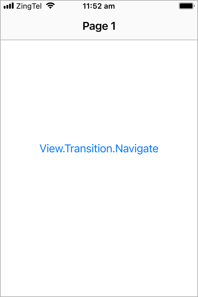
View.Transition.Navigate
View.Transition.PushLeft
View.Transition.PushRight

View.Transition.PushUp
View.Transition.PushDown
View.Transition.SlideLeft

View.Transition.SlideRight
View.Transition.SlideUp
View.Transition.SlideDown
View.Transition.Fade
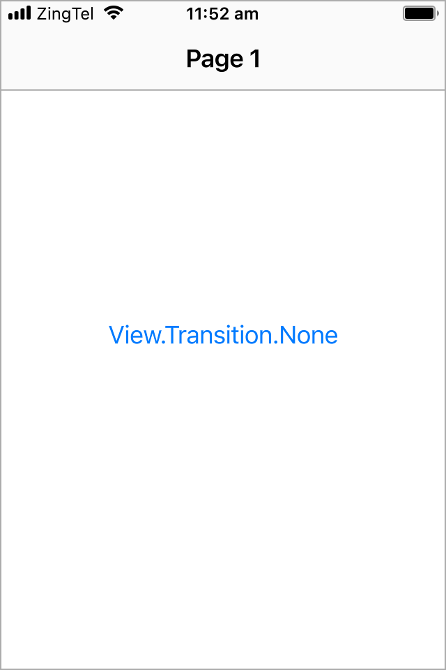
View.Transition.None