
Extends Item
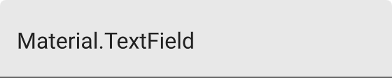
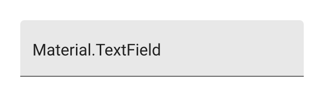
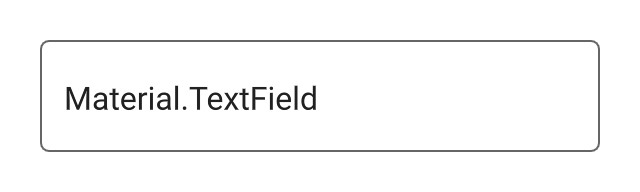
Material.TextField
A material design styled text input field.
True if the field is enabled, false otherwise. A disabled field has a dimmed appearance and wont accept user input.
property Material.TextField.Style style: .Filled
The text field style.
Material.TextField.Style.Filled
Material.TextField.Style.Outlined
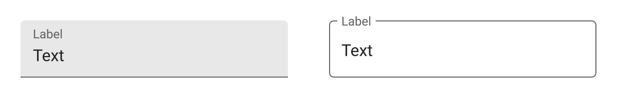
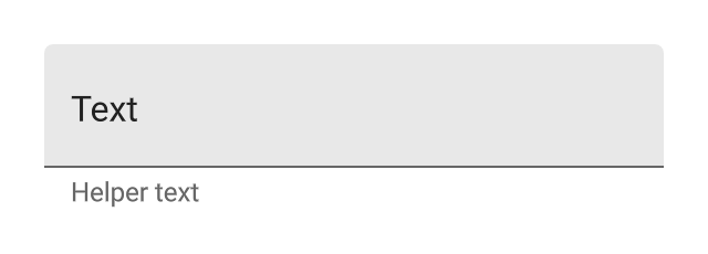
The label text is shown as a placeholder for the primary text when the field is empty, and shown as a label when the primary text is set.
The following example demonstrates the appearance of the label text for both field styles.
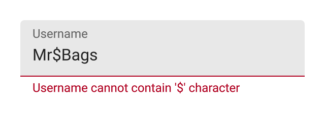
Helper text is shown directly below the text field, and can be used as a hint or to indicate an error.
When true, communicates to the user that there is an error in their input. This is often used in conjunction with helperText to explain the error.
property Color accentColor: #teal
The accent color, used for the colorful highlights on the text field.
property Color errorColor: #B00020
The color used to indicate an error in the field, when the Material.TextField.errored property is set.
property Color backgroundColor
The background color of the text field. This is a style dependent value, and is transparent by default in the Outlined style.
property Color secondaryColor: #666666
The color to use to secondary labels and the outline color in the Outlined style.
event accepted()
The text field's accepted event.
As the text is edited, the text property will update with any changes. When the user finishes editing the text, the accepted event will fire. This happens when either the field loses focus, or the return or done keys are pressed.
property Bool autocorrect: true
property TextEdit.KeyboardType keyboardType: .Default
property TextEdit.KeyboardAppearance keyboardAppearance: .Light
property TextEdit.AutocapitalizationType autocapitalizationType: .Sentence
These properties adjust the appearance and behavior of the keyboard shown for text entry into this text field on mobile devices.
The behavior of each property is detailed in the TextEdit reference.