Effect.DropShadow
Adds a drop shadow under an item.
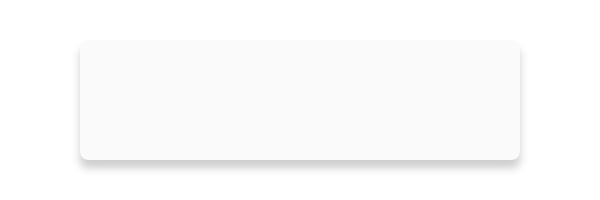
The shape of the drop shadow is determined by the bounding box of the item, not its contents. In the case of a Rectangle element, the rectagle's corner radius is also considered.
Rectangle {
    width: 60
    height: 60
    radius: 4

    with Effect.DropShadow {
        y: 2
        color: #gray
        blurRadius: 4
    }
}
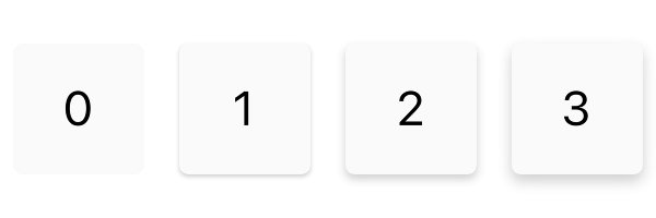
Multiple Shadows
Multiple drop shadows with different properties can be applied to the same item to increase the depth and definition of the shadow effect.
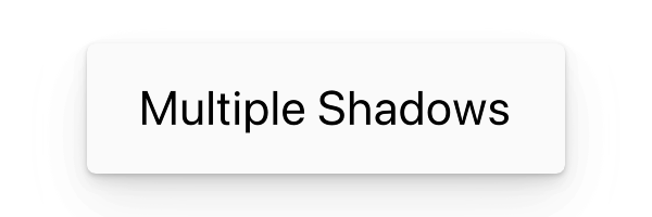
Rectangle {
    width: 300
    height: 60
    radius: 4

    with Effect.DropShadow {
        y: 1
        color: #gray
        blurRadius: y * 2
    }

    with Effect.DropShadow {
        y: 4
        color: #gray
        blurRadius: y * 2
        spreadRadius: -2
    }

    with Effect.DropShadow {
        y: 12
        color: #gray
        blurRadius: y * 2
        spreadRadius: -4
        opacity: 0.3
    }

}
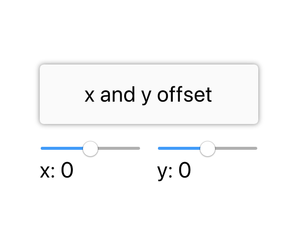
The offset of the shadow. By default the shadow is positioned at (0, 0), directly under the item.
Adjusting the offset simulates moving the light source that casts the shadow.
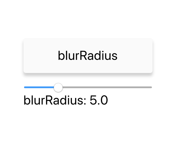
Larger values for blur radius give a more diffuse lighting appearance. Smaller values give a more direct lighting with sharper shadows.