
Extends Item
Material.Card
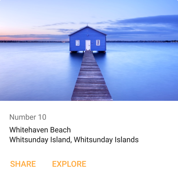
A material design card. A card is an elevated layer, used to visually group content.
The following example shows a card with some content.
Extends Item
A material design card. A card is an elevated layer, used to visually group content.
The following example shows a card with some content.