Extends Item
Apple.NavigationBar
The Apple.NavigationBar element provides an iOS style navigation bar.
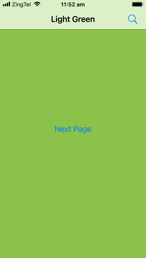
Although the navigation bar can be used as a standalone element, it is most powerful when used in conjunction with a StackView. Pages added to a StackView that have a full-width Apple.NavigationBar at the top, will automatically be linked together using the standard iOS transition appearance shown below.
Use the Next Page button to navigate forward in the example below.
property Apple.NavigationBar.Size size: .Normal
The navigation bar size.
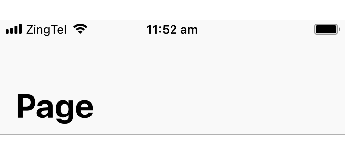
Apple.NavigationBar.Size.Normal
A regular title navigation bar.

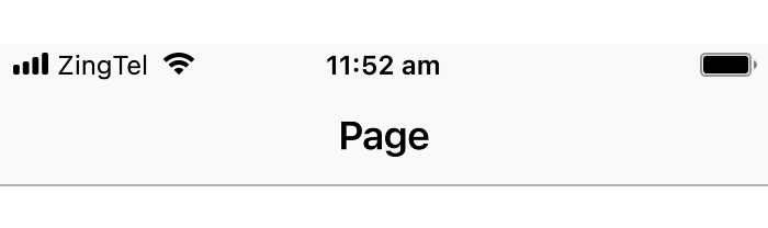
Apple.NavigationBar.Size.Large
A large title navigation bar.
On iOS, large title navigation bars are often used alongside a ScrollView and collapse into the normal title appearance when scrolled. For this effect, use the Apple.NavigationPage element.
property Apple.NavigationBar.Style style: .Default
The navigation bar background style.
Apple.NavigationBar.Style.Default
A light background color with dark text.
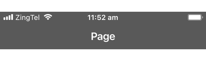
Apple.NavigationBar.Style.Black
A dark background color with light text.
property Bool translucent: true
Controls whether the navigation bar is translucent. When the bar is translucent, content behind it is blurred and tinted.
property Color barTint: #transparent
Sets the background color of the navigation bar, overriding the default tint color.
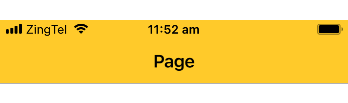
Apple.NavigationBar {
    title: "Page"
    barTint: #amber
}
property Bool showSeparator: true
Controls whether the separator line at the bottom of the navigation bar is shown.
property String titleFont: "San Francisco Semibold"
property String largeTitleFont: "San Francisco Bold"
The title text, color, font and size to use in the navigation bar.
The largeTitleFont property is used for the title font when the navigation is in large mode.
When set, overrides the text used for the back label.
When used in a navigation stack, Zing normally selects the back label text to show automatically. It first tries using the title property of the previous view and, if that doesn't fit, falls back to the generic text "Back" and, if that still doesn't fit, just shows the back arrow with no back label text at all.
If the backLabel property is set, its value is used instead of the previous view's title. Zing will still fall back to the generic text "Back", or no text at all, if the backLabel text does not fit.
If you want to disable the back label text, and only show the back arrow, you can set the backLabel property to the empty string "".
property Color tint: #Apple.Tint
Sets the tint color to use for the bar's back navigation button.
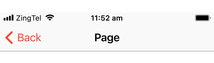
Apple.NavigationBar {
    title: "Page"
    tint: #red
}