Extends Item
Material.Button
A material style button.
The following shows examples of the raised and flat button styles.
property Material.Button.Style style: .Raised
The button style.
Material.Button.Style.Raised
A raised button style.

Material.Button.Style.Flat
A flat button style.

property Color secondaryColor: #white
The button colors.
The primary color value controls the button background in the Raised style, and the button text color in the Flat style.
The secondary color value defines the text color in the Raised style and has no effect in the Flat style.
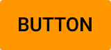
Material.Button {
    color: #orange
    secondaryColor: #black
}