
Extends Item
Apple.Button
An iOS style button.
The following shows an example of a disabled and enabled button.

Apple.Button {
    label: "Button"
}
The button's label text and icon to show. A button can have an icon, a label, or both.

You can use any project image or symbol for the icon.
There are also 16 bespoke icons that correspond to the default button icons used in iOS. These are shown below.
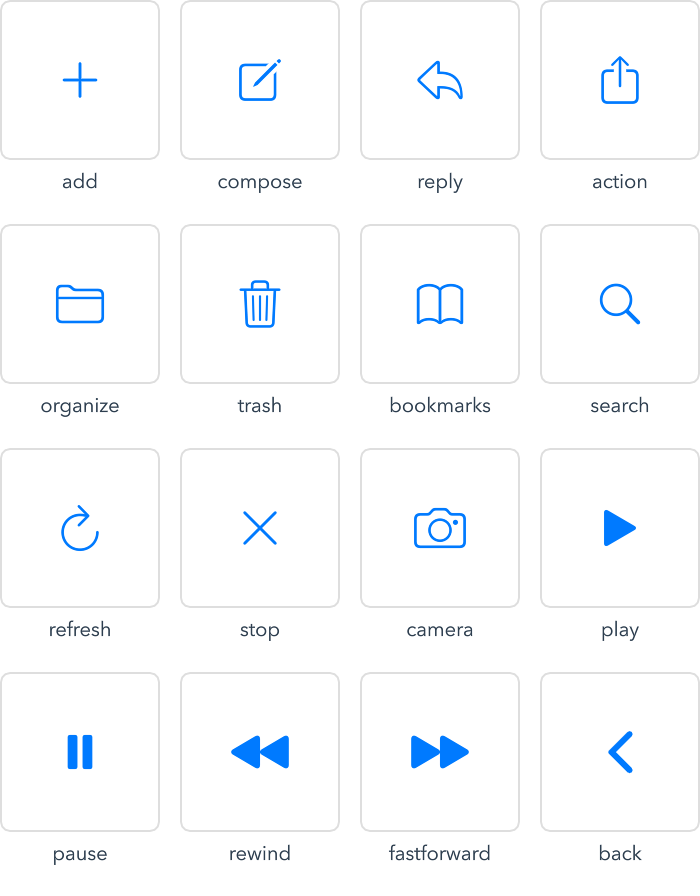
These icons are found in the ":/Apple/Button" path, and are used like this:
Apple.Button {
    icon: ":/Apple/Button/reply"
}