
Welcome!
You're reading the Zing Guide. The Guide walks you through everything you need to know to become a Zing master.
The Zing Reference covers all the different Zing elements and APIs. You access the Reference by switching tabs at the top of this window.
Help shortcut
Help shortcut
Join the Community
Learning together is more fun. Join our Slack channel or Facebook group to ask questions and get answers and feedback from others.

Getting started
Create a new project using the "File » New Project..." menu.
Create a new project by opening the menu in the top left of the Zing Studio window and choosing "New Project...".
Projects
Each prototype is its own Zing project.
Open projects all appear in the projects bar at the left hand side of the window. You can drag the project icons to rearrange them, and use keyboard shortcuts to quickly cycle through recent projects.
Project shortcuts
Project shortcuts
A Zing project is just a regular folder containing your code and asset files. Projects are self-contained, and can be moved or shared by copying the contents of the project folder.
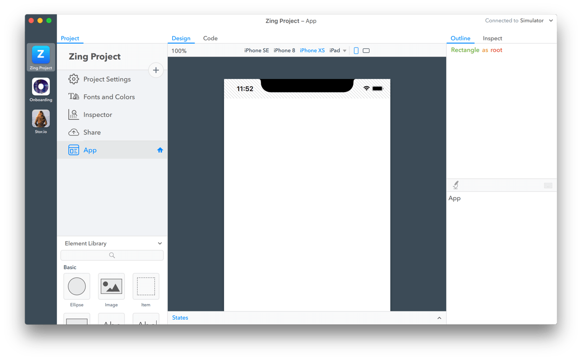
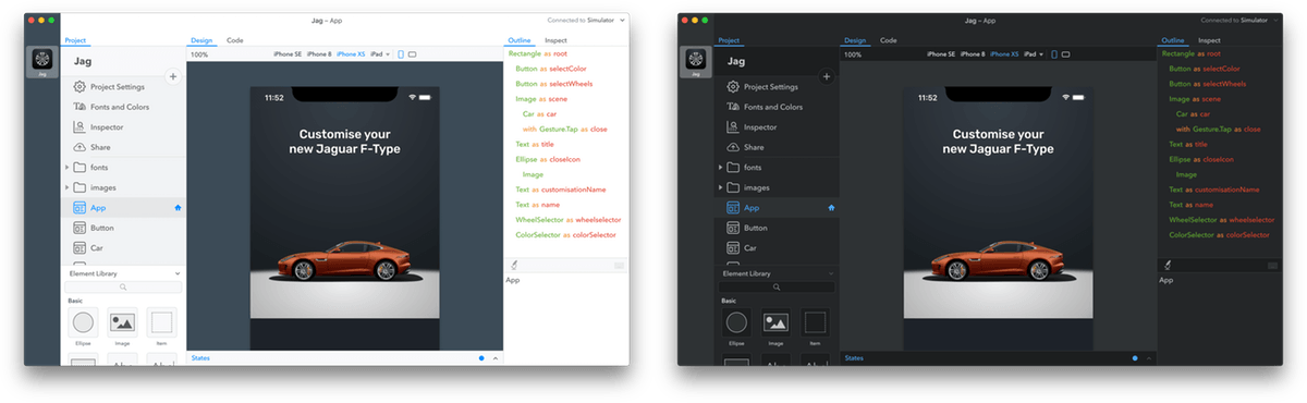
To the right of the projects bar is the project browser. The project browser lists all the elements, images and other asset files in the current project, and provides access to various project settings and tools.
The project's name is shown at the top of the project browser. The name is used to identify your project within Zing Studio, and when you share or export it. To change a project's name, double click it and enter the new name.
Previewing
In Zing running your prototype is called "previewing".
Previewing is automatic. As you modify the project in Zing Studio, the preview will update in real time. You can preview a project on your Mac, with the builtin simulator, or on an iOS or Android device, using the Zing Preview app.
Previewing is automatic. As you modify the project in Zing Studio, the preview will update in real time. You can preview a project on your PC, with the builtin simulator, or on an iOS or Android device, using the Zing Preview app.
The Preview Selector, in the top right of the Zing Studio window, is used to switch between the available preview targets, or to temporarily disable previewing.
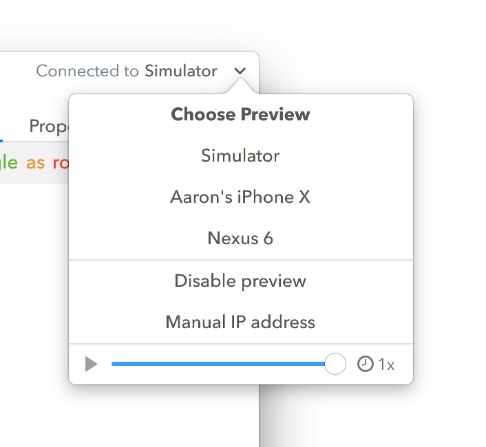
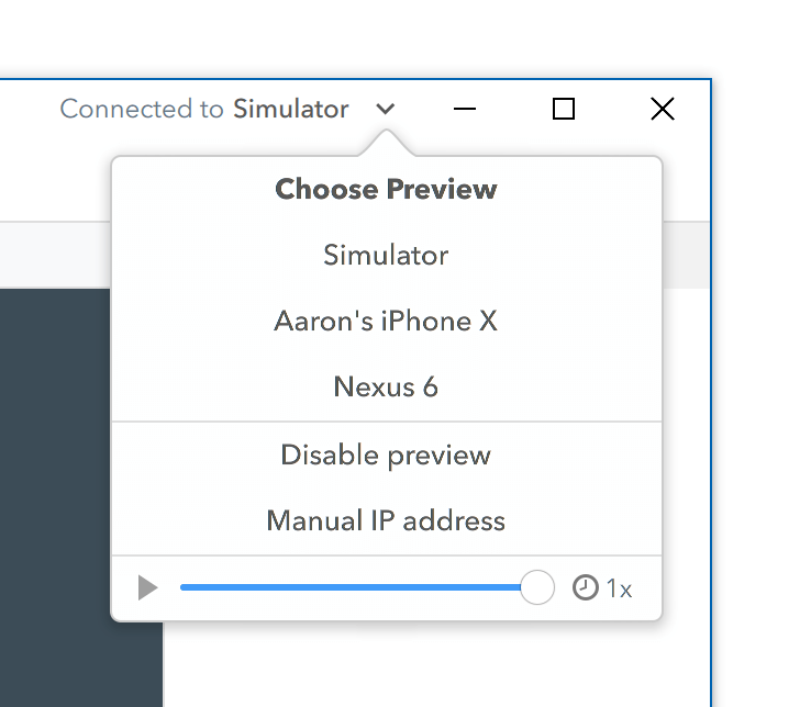
Simulator
The simulator can emulate a range of iOS and Android devices. The simulator is not a separate application, but is displayed automatically whenever you select "Simulator" from the Preview Selector.
You configure the simulator via the "Preview » Simulator" menu, or by right clicking on the simulator window. From there you can choose the device to simulate and adjust its orientation and scale.
You configure the simulator using the simulator window menu. From there you can choose the device to simulate and adjust its orientation and scale.
Simulator shortcuts
Simulator shortcuts
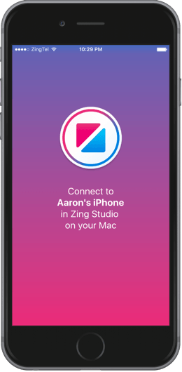
Zing Preview
The free Zing Preview app allows you to preview directly on iPhone, iPad and Android devices. The simulator and Zing Preview both provide the same functionality, but Zing Preview is way more fun!
To install Zing Preview, search for "Zing Preview" in the Apple App Store or Google Play Store, or visit the link below on your iOS or Android device.

When Zing Preview is open, your phone should appear automatically in the Preview Selector list. Zing Studio and Zing Preview communicate over WiFi, so if it isn't showing check that your Mac and device are connected to the same WiFi network.
When Zing Preview is open, your phone should appear automatically in the Preview Selector list. Zing Studio and Zing Preview communicate over WiFi, so if it isn't showing check that your PC and device are connected to the same WiFi network.
If you're using an iOS device, you can also connect via a lightning cable when WiFi isn't available. When your device is plugged in, it will appear with a small cable icon next to it in the Preview Selector.
Appearance
Zing Studio supports both a light and a dark mode theme. Zing will automatically switch themes to match your Mac's appearance.
Zing Studio supports both a light and a dark mode theme. Zing will automatically switch themes to match your PC's appearance.
You can manually activate the theme you prefer under the View menu, or quickly toggle between them using the keyboard shortcut shown below.
Theme shortcut
Theme shortcut
Basic concepts
Whenever the guide refers to a sample project, a banner like the one above will appear. Click "Save" to create a copy of the project.
Similarly, some examples in the guide have a "Show Me" button which will create a project to demonstrate the concept in a more complete context.
Once you're done, it is easy to keep or delete the samples.
Designable code
Zing is structured around a concept we call "designable code".
Prototyping tools usually separate the tasks of visual design and writing code. With those systems, you first design limited layouts using a visual tool, and then add more complex behavior by "puppeteering" it from a separate coding language and editor.
Zing takes a different approach, unifying design and code by presenting two "views" of your prototype - a design view and a code view. Changes made in the design view are reflected in the code view, and changes made in the code view are reflected in the design view.
This is best demonstrated with an example.
You can quickly jump back and forth between the design and code views using the next and previous tab keyboard shortcuts.
Studio shortcuts
Studio shortcuts
Elements
Prototypes are built by combining reusable components called elements.
Elements are a central concept to Zing. Zing Studio comes with many built in elements and you can also build your own custom elements to use in your projects.
A few builtin elements are shown below. Examples in the Zing docs are live, so you can interact with the elements to get an idea of how they behave!
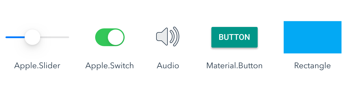
Elements are configured by assigning properties. Properties control the appearance and behavior of an element. For example, the Rectangle's "color" property sets its fill color and the Material.Button's "label" property the text shown.
Items
Visual elements are often called "items" for short. For example, the Rectangle element is an item, whereas a non-visual element like Audio is not.
Every builtin element and its properties is detailed in the reference section of this documentation. As an example, two properties from the Material.Button documentation are reproduced below.
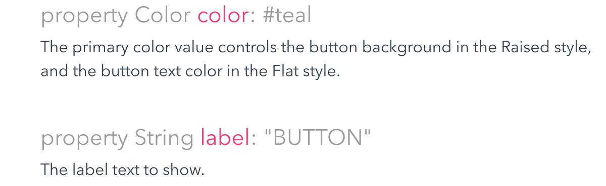
Each property has a type, such as Color or String. The property type constrains the value that can be assigned to the property. For example, it is invalid to assign a number value to a Color property. If you try, Zing will detect the error before your prototype even runs, allowing you to quickly fix the mistake.
Every property also has a default value which is shown in the documentation. The default value is used if you have not explicitly assigned a value to the property. In the case of Material.Button, it will be #teal colored with a label of "BUTTON".
A property's default value isn't always straight forward, and can depend on the value of the element's other properties or the way in which the element is being used. In these cases, the default value will be described in the documentation text.
Now that you have a basic understanding of elements and properties, the following sections will show you how to use the design and code views to add elements and set their properties in your prototypes.
Design View
The design view allows you to add, position and configure visual items. The view presents an infinite canvas that can be scrolled in any direction, and zoomed in and out.
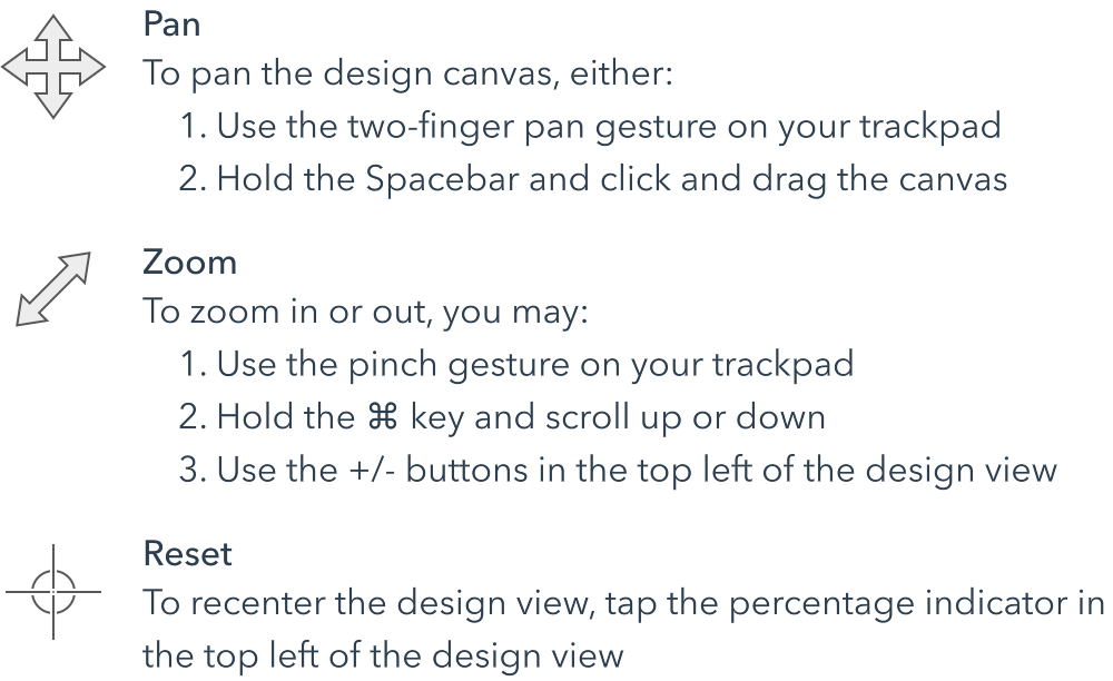
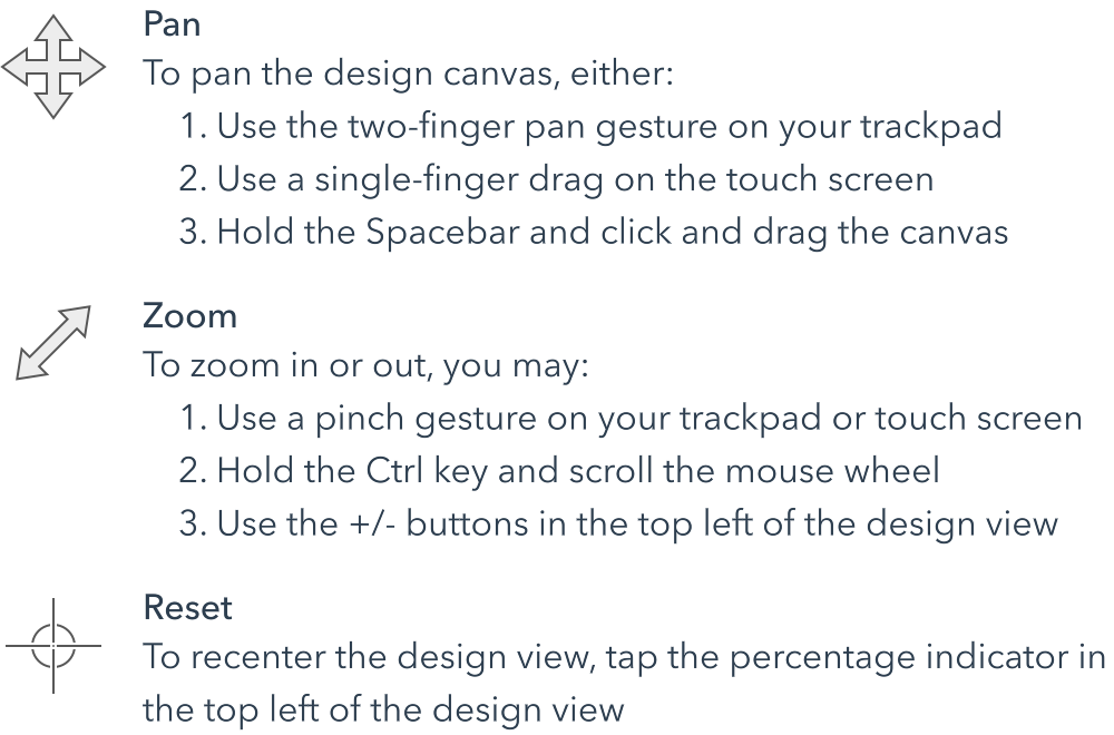
Use the view below to experiment with the interaction options that work best for you.
Adding elements
To add elements, drag them out from the "Element Library" and drop them on the canvas.
The element library contains a list of all the builtin Zing elements that are useful in the design view. You can scroll this list until you find the element you need, or, if you already know the element's name, use the search filter to quickly jump to it.
To the right of the design canvas is the outline panel. The outline panel shows the tree of elements that make up the design. You can reorder items and change their container by dragging them in the outline.
Selecting items
Selecting items in Zing is easy; just click on the item on the canvas or in the outline panel. As you hover over an item, it will be highlighted to indicate that it will be selected when you click.
Once the item is selected, you should see eight resizing handles, one in each corner and one in the center of each edge.
You can also pick items using the design canvas context menu. This is useful for selecting obscured items, as all the items under that point on the canvas are shown.
You can deselect items by clicking the empty space in the design canvas, or by pressing the Escape key.
Selection shortcuts
Moving items
You can move an item by grabbing it and moving it around with the pointer. As you move (or resize) an item, it will automatically snap to smart guidelines that align it with adjacent items and its container. You can disable smart snapping by holding the Command key while dragging.
You can move an item by grabbing it and moving it around with the pointer. As you move (or resize) an item, it will automatically snap to smart guidelines that align it with adjacent items and its container. You can disable smart snapping by holding the Ctrl key while dragging.
If you hold the Shift key as you drag, movement will be locked to either the horizontal or vertical axis, even if your pointer drifts slightly.
Moving keyboard modifiers
Moving keyboard modifiers
Locking selection
When you click and drag an item, it will be selected and moved to its new location. Usually this is what you want, but it can be a problem if want to move an item that is obscured by another. In that case, clicking on the target item would select the item obscuring it and move that instead.
To work around this, you can hold down Option and Command keys to lock the current canvas selection.
To work around this, you can hold down Ctrl and Alt keys to lock the current canvas selection.
With the selection locked you can freely click and drag the target item without the selection changing. Infact, when the selection is locked you can click and drag anywhere on the canvas and the selected item will be moved.
The selection lock applies to all designer tasks that operate on the current selection, including moving and resizing items, context menus and drop targetting.
Selection keyboard modifiers
Selection keyboard modifiers
Resizing items
You can resize an item by grabbing and dragging any of the eight resize handles that appear when an item is selected. To resize just the width or height, grab the resize handles on the sides of the layer. To resize in both dimensions, use the corner handles.
If you also hold down the Shift key while resizing, the item will be resized proportionally; keeping the width and height at the same ratio.
Holding down the Option key while resizing will cause the item to resize about the middle, instead of the opposite edge. This keeps the center point of the item constant, while changing the size.
Holding down the Alt key while resizing will cause the item to resize about the middle, instead of the opposite edge. This keeps the center point of the item constant, while changing the size.
Resizing keyboard modifiers
Resizing keyboard modifiers
Properties panel
The properties panel allows you to assign property values, and to precisely modify an item's position and size. It appears as a new tab alongside the outline panel whenever an item is selected.
The different ways to activate the properties panel are shown in the video below. When you select an item from the design canvas, it will automatically switch to the properties panel. You can also view the properties panel for any item in the outline panel by either clicking on the disclosure button that appears when you hover over it, or by selecting the item and manually changing tabs.
When the properties panel is visible, you can return to the outline panel by pressing the Escape key, or by manually switching back to the Outline tab. Pressing Escape twice will first return to the outline panel, and then deselect the item.
Properties panel shortcuts
Property values
Setting a property is as simple as modifying the corresponding value in the properties panel.
When you change a property's value, you have given it an assigned value. A property that you have not set still has a value, called the default value. To reset an assigned property to its default value click the clear button that appears next to it.
You can also edit text and images directly on the design canvas. If the text or image is embedded inside a more complex element, the design view will locate and modify the appropriate element property.
Code View
The code view gives you full control of your prototype.
Every change that you can make in the design view is reflected in the code vide. In addition, you can add property expressions, event handlers and other functionality in code that is not available from the design view.
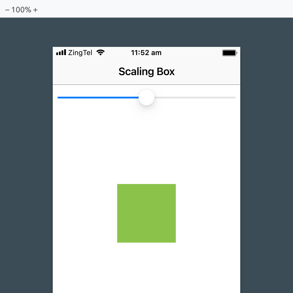
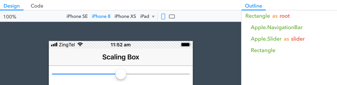
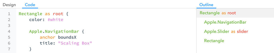
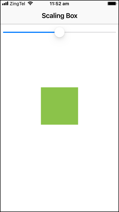
The code for the Scaling Box project looks like this.
 1
 2
 3
 4
 5
 6
 7
 8
 9
10
11
12
13
14
15
16
17
18
19
20
21
22
23
24
Rectangle as root {
    color: #white

    Apple.NavigationBar {
        anchor boundsX
        title: "Scaling Box"
    }

    Apple.Slider as slider {
        anchor boundsX = parent.boundsX - 8
        anchor top = previous.bottom + 8
        maxValue: 1.5
        minValue: 0.5
        value: 1
    }

    Rectangle {
        anchor center
        scale: slider.value
        color: #lightgreen
        height: 100
        width: 100
    }
}
Outline panel
The outline panel is also available in code view. You can reorder and reparent elements in the outline panel by dragging them, just like you can in design view.
Selecting an element in the outline moves the text cursor to the element's location in the code. Likewise, moving the cursor in the code changes the element selected in the outline panel.
The "selection" is synchronized between the code and design views, allowing you to quickly jump between them when editing an element.
Adding elements
Every Zing file begins with a root element declaration. Children are then declared recursively inside their container, naturally expressing the design hierarchy.
The basic template for declaring an element is the element name, followed by an opening and closing brace. Within the braces is the element's body, where you define its initial state and children.
ElementType {
    anchors
    properties
    child elements
}
Anchors are a convenient way to set the size and position of an item, but are ultimately just shortcuts for setting the x, y, width and height properties. We wont discuss them here, but you'll learn all about anchors in Guide: Anchors.
Property values
The syntax for assigning a property a value is the property's name, a colon and the value you want to assign it.
propertyname : value expression
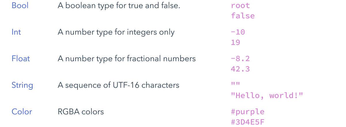
There are six basic property value types: bools, numbers, colors, enums, strings and urls. Here is an example for each:
Material.Switch {
    value: true
}

Rectangle {
    radius: 8
    color: #lightblue
}

Apple.SearchBar {
    style: .Minimal
    placeholder: "Search"
}
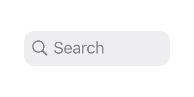
Image {
    source: "uluru.jpg"
}

Property expressions
The property values shown above can be assigned from both the design and code views. These constant values are called "literal" values.
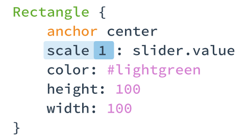
Properties can also be assigned a "property expression". In the Scaling Box project, the light green rectangle's scale property is assigned the expression "slider.value".
17
18
19
20
21
22
23
Rectangle {
    anchor center
    scale: slider.value
    color: #lightgreen
    height: 100
    width: 100
}
When a property is assigned an expression, the result is calculated and managed automatically by Zing.
Property expressions are reactive to changes. As you move the slider the rectangle's scale is automatically updated to reflect the slider's current value. Try it out by adjusting the slider and observing the rectangle change scale.
Property expressions are very versatile and can be applied to any property. For example, try adding the line shown below which uses an additional property expression to the adjust the rectangle's rotation.
If you make this change in your own project, you should get a prototype that behaves like this:
Ids
To reference a specific element in a property expression or other code, the element must have an id. An id is an optional name that you use to refer to the element instance.
Ids must be unique, and always start with a lower case letter.
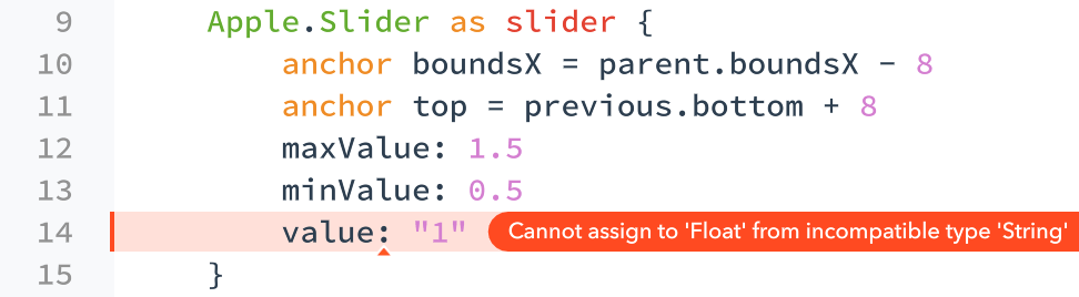
Assigning an element's id in code is done with an "as" clause after the element type name, like this example from the Scaling Box project:
 9
10
11
12
13
14
15
Apple.Slider as slider {
    anchor boundsX = parent.boundsX - 8
    anchor top = previous.bottom + 8
    maxValue: 1.5
    minValue: 0.5
    value: 1
}
You can also add or update an id using the outline panel, by double clicking the appropriate element to activate the id editor. Editing ids through the outline panel has the added advantage of automatically updating existing code to use the new name.
Errors
Zing continuously scans your project for errors as you type. When your project contains errors, previewing is disabled until they are fixed.
Descriptions of issues are shown next to your code, with the small triangle indicator pointing to the exact location of the problem. If the full message doesn't fit you can mouse over the offending line to see the rest.
To quickly cycle through the errors use the keyboard shortcuts shown below.
Error shortcuts
Error shortcuts
You can find a complete list of project errors in the errors panel. The errors panel is located directly below the outline panel at the bottom right of the Zing Studio window. Clicking on an error will jump directly to the code at fault.
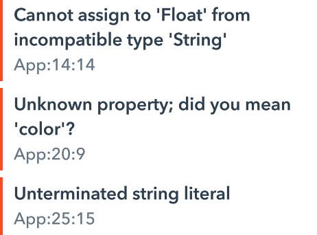
When possible, an error's description will end with "did you mean" and a proposed solution to the problem. In these cases, mousing over the error in the code view, or right clicking it in the errors panel will expose a "Fix" button to apply the resolution.
Comments
Comments can be used to temporarily disable, or add notes to, your code. Commented code and text is ignored and your prototype behaves as though it wasn't there.
Block comments
In addition to single line comments, Zing also support c-style block comments.A comment begins with two forward slash characters and continues until the end of the current line. The following example shows how to use a comment to disable a line of code.
17
18
19
20
21
22
23
Rectangle {
    anchor center
    // scale: slider.value
    color: #lightgreen
    height: 100
    width: 100
}
You can use the following shortcut to quickly comment and uncomment the current line (or lines if multiple lines are selected).
Studio shortcut
Studio shortcut
Source files
Programs are split into one or more "zing" files. The files that make up your program are shown in the project browser, along with the other assets used by the project.
Each source file in a program actually defines a new Zing element.
Elements are an extremely versatile concept in Zing. However, this versatility can often make it tricky to figure out exactly what an element is.
At the most fundamental level, an element is just a component that Zing can create instances of. This flexibility means that an element could define a basic control, such as a button, a UI fragment that is used multiple times or even an entire application screen or view.
An element is equivalent to a class in a traditional programming language. When compared to a design tool, such as Sketch, elements combine the functionality of both symbols and artboards.
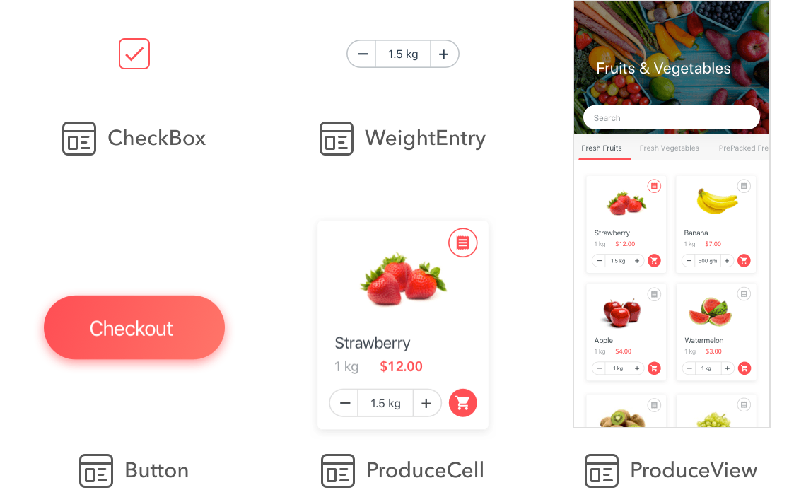
A few examples of the elements that you might create for a simple shopping app are shown below. The CheckBox, Button and WeightEntry elements are all themed versions of standard user interface controls. The ProduceCell element is a configurable UI fragment which is used many times by the ProduceView element to display and select the produce.
To distinguish them from the pre-built elements that come with Zing Studio, we sometimes call these "project elements".
Element composition
When we previously introduced elements, we implied that they are indivisible building blocks. In reality, even simple elements are built by combining other, existing elements.
The source code in a project file describes how to combine the existing elements together to create the new project element.
Apple.Slider
Even many of the elements that come with Zing Studio are built out of other elements.
For example, Apple.Slider is composed of two colored Rectangle's, one for each end of the slider track, an Image for the slider's handle and some logic code to glue it all together.
Hover over the slider below to see an expanded view of these parts.

As elements are very flexible you ultimately have a lot of freedom in how you structure your project. As a general rule, you should create separate elements for components in your project that you use multiple times and for components that you want to work on in isolation.
Example element
The "Slider element" project shows how this works in practice by reproducing the Apple.Slider element shown above. For simplicity, the created Slider element looks correct and can be dragged back and forth, but it doesn't expose a value property like a real slider would.
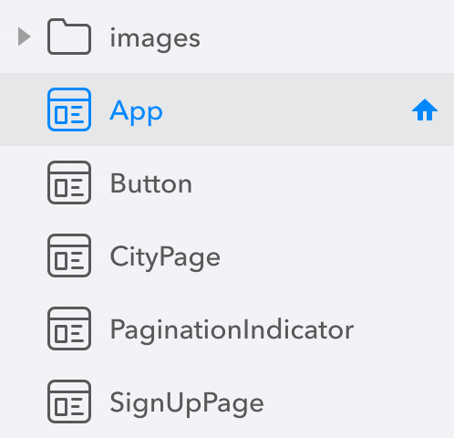
The project is made up of two files - App and Slider.
The Slider element defines the slider control element. A collapsed version of its source code is shown below.
| From Slider |
Item as root {
    Rectangle as leftTrack {…}
    Image as handle {…}
    Rectangle as rightTrack {…}
}
The Slider is made up of the three track and handle elements, grouped together as the children of an outer Item. That's really all there is to defining a brand new element!
The Slider element can be used just like any other element in both code and design views.
| From App |
Rectangle as root {
    color: #white

    Slider {
        anchor center
    }
}
To add instances of the Slider element in design view, just drag it from the project browser and drop it in place.
The Slider element is pretty basic. In Guide: User elements you will learn more about creating rich user elements that expose properties that allow you to configure the element's appearance and state.
Managing files
To add a new element file, either click on the "+" add element button at the top of the project browser, or use the "New" menu in the project browser's context popup.
Element names must be unique, only include letters and numbers and start with an uppercase letter. If you enter an invalid or duplicate name, Zing will correct it for you automatically.
To rename an element, with it already selected in the project browser either tap it or press the Return key. Alternatively, select "Rename" from its context popup menu.
To rename an element, with it already selected in the project browser either tap it or press the Enter key. Alternatively, select "Rename" from its context popup menu.
Whenever you rename an element, the code in your project is updated to use the new name.
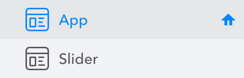
Home element
Every Zing project has a "home element".
The home element is the element that Zing shows when it previews your prototype. Zing doesn't "run" your prototype in the traditional sense - it just creates an instance of the home element and presents it on screen. Zing really is elements all the way down.
The App element has been the main view of all examples shown so far. The small home symbol next to it in the project explorer indicates that it is the home element.
Even though it has an important sounding name, there is nothing special about the App element. From Zing's perspective it is just another element. If you rename the App element, it continues to work the same.
You can make any element the home element by pressing and holding the home icon that appears when you mouse over it, or by selecting "Make Home Element" from the element's context menu.
Inspecting
Once you start using property expressions and interacting with your prototype, it isn't always obvious what the value of an element's properties are. Zing allows you to inspect the current value of any property in a running prototype.
As the inspection tools all show the runtime values of a prototype, they can only be used when your project is actively being previewed. If you have disabled preview, or your project contains errors, none of the inspection tools will be available.
Microscope
The concrete value of a property expression can change over time depending on the expression's inputs. The Zing "microscope" allows you to peek at the current value of a property expression.
You can enable the microscope by tapping the microscope icon below the code outline, or by using the microscope shortcut key, when the project is being previewed.
Microscope shortcut
Microscope shortcut
The image below shows the initial state of the rectangle item in the Scaling Box prototype. The microscope has annotated the rectangle's scale property with its calculated value.
As you interact with the slider, the microscope updates the code annotations. This is what it looks like as you drag the slider to the right.
For clarity, the microscope only adds annotations for property expressions. Properties that are assigned literal values and haven't changed, such as the rectangle's color property, are left alone.
If a property expression or literal value is overwritten by another value, it is shown struck out and the property's current value is shown as an annotation. This is what happens to the slider's value property as it is dragged and its initial assigned value of 1 is replaced with user input.
Inspect panel
When you want to see the value of all of an element's properties, you can use the inspect panel.
The inspect panel is accessible via the "Inspect" tab, located next to the outline panel whenever an element is selected in the design or code views and the project is being previewed.
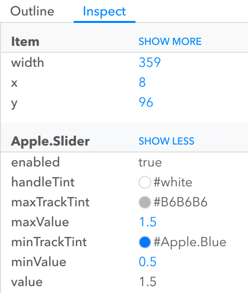
As elements can contain many properties, the inspect panel tries to anticipate the properties you are interested in. If you want to see a property that isn't shown, click "show more" to see a complete list.
As with the microscope, the inspect panel updates as you interact with the running prototype and the property values change.
If a property value is colored blue, you can click on it to jump to the location in your code where the value was assigned. If the location isn't available, it means the property is either still assigned its default value, or it was modified by the element itself.
Logging
If an error occurs while previewing, the problem is logged. Logged messages appear in the "log bar" at the bottom of Zing Studio window.
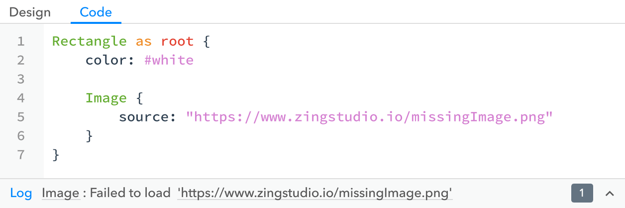
The log bar only shows the latest message. To see the entire log, click the arrow on the log bar to open the "log panel". The log panel can be scrolled and resized if necessary.
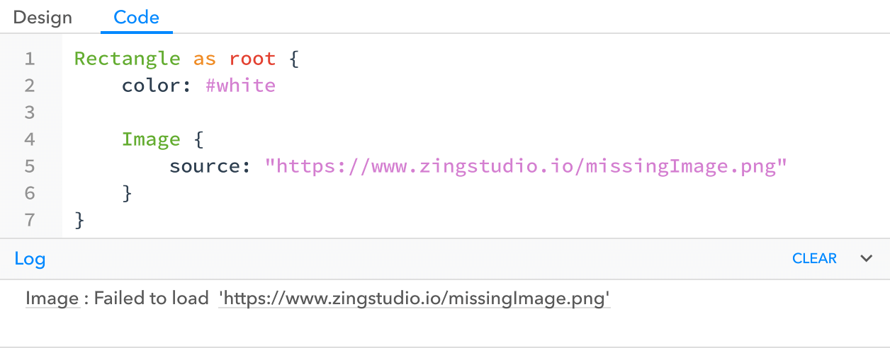
Log messages can contain links back to the code that caused them, shown as underlined text in the log bar or panel. For example, the "Image" link will jump to the Image element, and the url to where the source property was assigned the value.
Prototypes can also log their own messages to indicate when something has happened or to help debug a problem by calling the System.log() method.
Material.Button {
    on activated {
        System.log("I was activated!")
    }
}
Messages logged by System.log() appear in the log bar and panel like other messages and include a link back to the code that created them.
Log shortcuts
Log shortcuts
Code
You can add behavior to your prototypes by writing logic code in Zing Script. Code allows you to assign property expressions, control animations, transition to other views, fetch data and populate your prototype.
This chapter introduces you to the most important parts of Zing Script. More details can be found in the Language reference documentation.
Already a coder?
Zing Script is most similar in syntax to JavaScript and C#. However, unlike JavaScript and other dynamic languages, Zing Script is statically typed.Property expressions
An expression is a piece of code that directly computes a value.
Here are a few example expressions:
32
rectangle2.width * 3
root.enabled ? 15 : 13
Expressions are a basic tenet of every programming language, and are generally accepted everywhere a constant value would be.
In Zing Script, an expression can also be assigned directly to a property - called a "property expression" - and the property value will automatically update whenever the expression's computed value changes.
Text {
    size: root.enabled ? 15 : 13
}
For the same of clarity, the following examples are sometimes written as standalone expressions and sometimes as property expressions.
Literal values
The most basic expressions are boolean, number, string and color literal values.
More information on each type and its literal syntax is available from the respective reference documentation page.
Element properties
Element identifiers
Local properties
this and parent
Arithmetic
In addition to the operators shown here, there are many more advanced mathematical functions and constants defined in the Math namespace.
Zing supports six arithmetic operators - the addition, subtraction, multiplication, division, remainder and power operators.
Each arithmetic operator takes two input operand expressions. If both inputs are integers, then the output will also be an integer. If either input is a floating point number then the output will also be floating point. The exception to this is division, which always returns a Float.
For example, the general form of the addition operator follows.
left hand side expression + right hand side expression
For simplicity, all of the examples below use literal values for their left and right hand side expressions, but any valid expression is allowed.
The four standard arithmetic operators for number types behave using the regular rules.
1 + 2           // equals 3
5 - 3           // equals 2
2 * 3           // equals 6
10 / 4          // equals 2.5
The remainder operator finds the largest whole number of multiples of the first operand that will fit into the second operand, and returns the value that is left over.
9 % 4 // equals 1
The power operator returns the left operand raised to the power of the right operand.
3 ^ 2           // equals 9
2 ^ 0.5         // equals 1.4142
Each operator has an precedence, which defines the evaluation order when more than one operator is used. You can use parentheses to change the order of evaluation.
10 + 2 * 3      // equals 16
(10 + 2) * 3    // equals 36
Strings
Logical operators
Event handlers
Events notify you when something happens, such as a button being pressed or a timer elapsing.
Zing Script is event driven. This means that code runs in response to events. To respond to an event, you write an event handler, which is a block of code that is run when the event is emitted.
Element events
Element events are emitted by element instances. Events notify you when something happens, such as a button being pressed or a timer elapsing.
The events emitted by an element are shown in that element's documentation. For example, the documentation for the Apple.Button.activated() event is reproduced below.

Event handlers are written inline with the element emitting the event in the code view. The following snippet shows an event handler that randomizes a button's tint color each time the button is activated.
Apple.Button {
    label: "Tap Me!"

    on activated {
        tint = Color.random()
    }
}

Events can also have parameters, which pass extra information to the event handler.
For example, the the Gesture.tapped() event includes a single argument.

To access the parameter value, you add a receiver argument name to the event handler. The receiver name is up to you and doesn't have to match the name used in the documentation.
Rectangle {
    on Gesture.tapped(point) {
        System.log("Rectangle tapped at", point)
    }
}
Although the event handler is always written in the code view, you can create the handler directly from design view.
Under the "Events" item of an element's context menu in design view is a list of all the events emitted by the selected element. When you choose one, Zing Studio will switch to the code view and jump to the event handler if it already exists, or create one, complete with parameter receivers, if it doesn't.
Start event
Zing also provides a global "start" event, that is emitted when an instance of a project element is created. The start event should be used sparingly, but is useful to do any initial setup work the element might require.
As it applies to the project element itself, the start event handler should declared outside the main element tree in a source file.
| From App |
Rectangle {
    …
}

on start {
    // ... event handler code ...
}
Remember that the start event handler will run for each separate instance of the project element. In the case of a prototype's home element, this generally means it will run once, but in a reusable button element, the event handler will run for each instance of the button.
Blocks
The body of an event handler is called a "code block".
A code block is a series of statements, surrounded by braces, that are run one after another until the block finishes. A block that contains no statements is valid, and is called an empty block.
The statements in a block are separated by newlines (or semicolons).
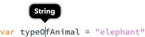
Variables
Variables store a value temporarily for later use within a block. Here are two examples of variable declarations:
Int numberOfAnimals
String typeOfAnimal = "elephant"
Variable names begin with a lowercase letter, but can otherwise consist of letters, numbers and underscores.
Variables are "block scoped" and must be declared before they are used. If you declare a variable within a block, you cannot use it outside of that block.
if pinCodeCorrect { String secret = getSecret() }System.log(secret) Variable is not accessible here
Of course, you can use outer variables within nested blocks.
String secret = "Unknown"
if pinCodeCorrect {
    secret = getSecret()
}
System.log(secret) // Logs the secret if pin correct, or "Unknown"
Variable type
Every variable has a type, which appears before the variable name in its declaration. Only compatible values can be stored in a variable. For example, you can't store the number 10 in a String variable.
A variable type can be any one of the types shown in the reference tab, or a project element type. Some of the more common types are shown below. Use the link to their associated documentation to learn more about each.
Bool stores a boolean true/false value.
Bool isDone = true
Bool fastEnough = false
Int and Float store integer and floating point values respectively. Every Int can also be stored in a Float, although the reverse is not true.
Int numberOfLegs = 2
Int temperature = -40
Float pi = 3.14159
Color stores a color value.
Color skyColor = #lightblue
Color skinColor = #FF9800
String stores textual or binary data.
String buzz = "Get your ass to Mars!"
An Array stores a list of other values. Array type can be written in one of two ways, but both methods give the equivalent array type.
Array<Int> numbers = [1, 2, 3]
Int[] someMoreNumbers = [1, 2, 3] // Shorthand syntax
A Dictionary is an associative array that maps one value, called the key, to another another value.
Dictionary<String, Int> legs = [
    "Snake": 0,
    "Emu": 2,
    "Dog": 4,
    "Centipede": 354
]
Element types store a reference to a compatible element instance.
Ellipse ellipse = null
Rectangle rect = new Rectangle
var
You can specify a variable's type explicitly, or use the var keyword to infer it.
Variables declared with the var keyword, automatically infer their type from their initial value. You can see the inferred type in Zing Studio by positioning the cursor inside the variable name in the editor.

Storage
There are two broad categories of types in Zing Script - value types and element types. In other programming languages, value types are sometimes called "stack" types, and element types are called "object" or "heap" types.
The type category effects how a value is stored in a variable or property.
All of the basic data-like types such as number, strings, arrays and dictionaries are value types.
Value type variables store their value directly. Assigning one value type to another copies the stored value. Any subsequent changes made to the value in the first variable will not affect the value in the second.
In contrast, an element type variable holds a reference an element instance and does not store the actual element data. As such, two variables can reference the same element instance and changes to the instance made through one variable will also be seen through the other.
Element instances are garbage collected, and automatically destroyed when there are no more references to them.
Element identifiers
To access the properties of elements in a Zing file, you can give them unique names. A valid element identifier, just like a variable name, must begin with a lowercase letter and contain only letters, numbers and underscores.
An element identifier is declared using the as syntax shown below.
ElementName as identifier {
    // initializer...
}
Here we use an element identifier to ensure two rectangles have the same size and color.
Rectangle as mainRectangle {
    width: 50
    height: 50
    color: #orange
}
Rectangle {
    width: mainRectangle.width
    height: mainRectangle.height
    color: mainRectangle.color
}

this and parent
The "this" and "parent" keywords refer to the expression's local and outer element instances respectively, even if they don't have an explicit element identifier.
In many cases, the use of this and parent can make code easier to write and understand. However, they are just convenience shortcuts, and an explicit element identifier can always be used in their place.
"this" refers to the element directly surrounding the expression.
Rectangle {
   width: 2 * this.height

   function area() -> Float {
       return this.width * this.height
   }
}
"parent" refers to the parent of the element surrounding the expression. In the following example, all uses of "parent" reference the outer Item element.
Item {
    Rectangle {
       width: 0.5 * parent.height

       function outerArea() -> Float {
           return parent.width * parent.height
       }
    }
}
Not all expressions have a defined parent. Toplevel elements, like that shown below, have no parent and using parent keyword will result in an error.
Rectangle {width: parent.width Invalid use of 'parent' in a root element context}
parent vs container
It is easy to be confused by the seemingly similar ideas of an element's parent and an Item's container property.
Local properties
Property expressions, functions and event handlers frequently read from and write to properties of the element containing them.
As it would be tedious to constantly preface these accesses with an element identifier, code and expressions are allowed to access the properties of its "this" object directly.
Rectangle {
    width: height // equivalent to "this.height"
}

Apple.Button {
    on activated {
        tint = #red // equivalent to "this.tint"
    }
}
This behavior is often called "implicit this" insertion, because it is equivalent to manually qualifying references with the this keyword.
Implicit this references only work if there are no conflicting names, such as element identifiers or variable names. In these cases, you can still access the property by explicitly inserting the this keyword (or an element identifier).
Rectangle { // "height" refers to the element. Must use "this.height"width: height Cannot assign to 'Float' from incompatible type 'Item'} Item as height {}
Operators
An operator is a special symbol that you use to check, change or combine values. For example, the addition operator "+" adds two numbers.
10 + 7
The values that operators affect are called operands. In the example above, the + symbol is the operator, and its two operands are the values 10 and 7.
Operators are unary, binary or ternary depending on whether they require 1, 2 or three operands.
Assignment
The assignment operator assigns the value on its right hand side to the variable or property on its left hand side.
variable = 10
root.width = 102
String concatenation
The addition operator is also overloaded to support String concatenation.
"hello, " + "world" // equals "hello, world"
Compound assignment
Compound assignment operators combine an assignment with an arithmetic operation.
a = 2
a += 3   // a is now equal to 5
There is a corresponding compound assignment operator for each binary arithmetic operator.
a += 3   // equivalent to a = a + 3
a -= 2   // equivalent to a = a - 2
a *= 4   // equivalent to a = a * 4
a /= 9   // equivalent to a = a / 9
a ^= 5   // equivalent to a = a ^ 5
a %= 7   // equivalent to a = a % 7
Compound assignment operators do not return a value.
Comparison
The comparison operators compare two operands, and return the boolean value true when the comparison is true and false when it is not.
Equality comparisons
The equality comparisons compare whether one value is exactly equal to another.
10 == 10   // True because 10 is equal to 10
10 != 11   // True because 10 is not equal to 11
The equality comparisons can compare any two operands of the same type.
Relational comparisons
The relational comparisons compare whether one value is less than or greater than another.
10 < 11    // True because 10 is less than 11
11 > 10    // True because 11 is greater than 10
10 <= 10   // True because 10 is less than or equal to 10
10 >= 11   // False because 10 is not greater than or equal to 11
The relational comparisons can compare two numeric operands or two string operands.
Ternary conditional operator
The ternary conditional operator is a special operator with three parts, which takes the following form
question ? answer1 : answer2
It is a shortcut for evaluating one of two expressions based on whether question is true or false. If question is true, it evaluates answer1 and returns its value; otherwise, it evaluates answer2 and returns its value.
The ternary operator is shorthand for the following pseudo code
if question {
    answer1
} else {
    answer2
}
The ternary conditional operator provides an efficient shorthand for deciding which of two expressions to consider. However, the ternary conditional operator should be used with care as it can lead to hard-to-read code if overused.
The code below demonstrates how you might use the ternary conditional operator in a property expression to set an item's height.
height: 60 + (header.visible ? header.height : 0)
Ranges
Zing includes two range operators, which are most useful for generating a numeric sequence as input to a for statement.
Closed range operator
The closed range operator creates a range spanning from the value of the left operand to the value of the right operand, inclusive of both values.
for var index in 1 ... 5 {
    System.log(index, "times 5 is", index * 5)
}

// 1 times 5 is 5
// 2 times 5 is 10
// 3 times 5 is 15
// 4 times 5 is 20
// 5 times 5 is 25
Both operands must be Ints.
Half-open range operator
The half-open range operator creates a range that runs from the value of the left operand to the value of the right operand, but does include the value of the right operand. It is said to be half open as it contains the value of the first operand, but not the value of the second.
Half-open ranges are particularly useful when you work with zero-based lists such as arrays, where it is useful to count up to (but not including) the length of the list.
var names = ["Bob", "Clair", "David", "Sarah"]
for var index in 0 ..< names.length {
    System.log("Person", index + 1, "is called", names[index])
}

// Person 1 is called Bob
// Person 2 is called Clair
// Person 3 is called David
// Person 4 is called Sarah
Both operands must be Ints.
Logical operators
Logical operators modify or combine the boolean logic values true and false. They are used most often as input to if and while statements.
Logical NOT operator
The NOT operator inverts a boolean value, such that true becomes false and false becomes true. The NOT operator appears immediately before the value it operates on.
var allowedEntry = false
if !allowedEntry {
    System.log("ACCESS DENIED")
}

// Logs "ACCESS DENIED"
As the NOT operator is a prefix operator, the production "if !allowedEntriy" is often read as "if not allowed entry".
Logical AND operator
The AND operator returns true if both its left and right operands are true, and false otherwise.
var hasDoorCode = true
var passedRetinaScan = false
if hasDoorCode && passedRetinaScan {
    System.log("Welcome!")
} else {
    System.log("ACCESS DENIED")
}

// Logs "ACCESS DENIED"
The AND operator short-circuits the evaluation of the right hand expression.
Logical OR operator
The OR operator returns true if either its left or right operands are true, and false otherwise.
var hasDoorKey = false
var hasPassword = true
if hasDoorKey || hasPassword {
    System.log("Welcome!")
} else {
    System.log("ACCESS DENIED")
}

// Logs "Welcome!"
The OR operator short-circuits the evaluation of the right hand expression.
Combining logical operators
You can combine multiple logical operators to create longer compound expressions.
if hasDoorCode && passedRetinaScan || hasDoorKey || hasPassword {
    System.log("Welcome!")
} else {
    System.log("ACCESS DENIED")
}

// Logs "Welcome!"
This example uses multiple && and || operators to create a longer compound expression. However, the && and || operators still operate on only two values, so this is actually three smaller expressions chained together.
The expression shown above can be read as "if we’ve entered the correct door code and passed the retina scan, or if we have a valid door key, or if we know the emergency password, then allow access".
It is sometimes useful to include parentheses when they are not strictly needed, to make the intention of a complex expression easier to read.
if (hasDoorCode && passedRetinaScan) || hasDoorKey || hasPassword {
    System.log("Welcome!")
} else {
    System.log("ACCESS DENIED")
}

// Logs "Welcome!"
Control flow
Control flow statements are used to control the flow of execution in a program. There are three types of control flow statements in Zing: loop statements, branch statements, and control transfer statements.
If statement
if condition {
    statements
} else if condition {
    statements
} else {
    statements
}
For loop
The for-in loop allows you to execute a block of statements multiple times, once for each value in a sequence, such as a range of numbers, or the values in an array.
for var index in 1...3 {
    System.log("index is", index)
}
// index is 1
// index is 2
// index is 3
The for-in loop looks like this:
for initializer in expression {
    statements
}
The source expression is only executed once, at the beginning of the loop. Modifications made to the source during the loop will not effect it.
The loop will execute once for each value in the source sequence. If the sequence is empty, the loop will not run at all and execution will continue following the closing brace. For each loop, the sequence value will be assigned to the initializer expression, and then the body statements will be executed.
This example iterates over the names array, and greets each name:
var names = ["Aaron", "Anna", "Sam", "Sarah"]
for var name in names {
    System.log("Hello,", name)
}
// Hello, Aaron
// Hello, Anna
// Hello, Sam
// Hello, Sarah
Zing also supports C-style for loops.
While loop
var result = 1
var factor = 4
while factor > 1 {
    result *= factor
    --factor
    System.log("current:", result)
}
// current: 4
// current: 12
// current: 24
while condition {
    statements
}
Zing also support C-style do-while loops.
Switch statement
A switch statement is used to compare the result of an expression against a collection of possible values.
var animal = "horse"
switch animal {
    case "human", "emu" {
        System.log("This animal has 2 legs")
    }
    case "dog", "horse", "cow" {
        System.log("This animal has 4 legs")
    }
    case "millipede" {
        System.log("A millipede has up to 750 legs!")
    }
    default {
        System.log("I don't know how many legs this animal has")
    }
}
// This animal has 4 legs
Switch statements consist of an expression, and a collection of case clauses like this:
switch expression {
    case value 1 {
        statements for 1
    }
    case value 2 , value 3 {
        statements for 2 or 3
    }
    default {
        statements for other
    }
}
The switch expression is first evaluated, and the result is compared to to each case clause value in order. If a matching value is found, the body statements for that case are run. After the body has run, the switch statement finishes and execution continues after the final closing brace.
If a matching case clause is not found, the default clause, if present, is executed instead.
Unlike switch statements in languages like C and Java, case blocks in Zing do not implicitly fall through by default and consequently do not require a terminating break statement. If you've never used a programming language that does require an explicit break, just pretend this section doesn't exist.
If you need C-style fallthrough behavior, you can use the fallthrough statement. When the fallthrough statement is run, execution jumps immediately to the start of the next case or default block and runs the case's body statements.
The example below uses fallthrough to create a textual description of a number:
var integerToDescribe = 5
var description = "The number " + integerToDescribe + " is"
switch integerToDescribe {
    case 2, 3, 5, 7, 11, 13, 17, 19 {
        description += " a prime number, and also"
        fallthrough
    }
    default {
        description += " an integer."
    }
}
System.log(description)
// prints "The number 5 is a prime number, and also an integer."
Advanced code
Creating elements
You can create new element instances dynamically using the new operator.
new Element name {
    initializer
}
Each call to the new operator returns a single new instance of the specified element. The initializer can be used to set initial property values, or omitted if not required.
Zing is garbage collected, so new'd instances will be destroyed as soon as there are no longer any references to them. Consequently, to ensure that an instance continues to exist after the code that created it terminates, it must be stored in a property, added to an array or, in the case of a visual Item, have its container set.
The following example creates four rectangles at random horizontal locations each time it is called. Notice how it clears the root children before each run, otherwise the rectangles would just accumulate indefinitely.
function createRectangles() {
    root.clearChildren();

    for (var ii = 0; ii < 4; ++ii) {
        var xPos = Math.random(0, 150)

        var r = new Rectangle {
            x: xPos; y: ii * 50
            width: 50; height: 50
            color: root.boxColor
        }
        r.setContainer(root)
    }
}
This example also demonstrates variable capturing. The rectangle's x and y properties are initialized with expressions that "capture" the value of the variables xPos and ii. This is called capturing as the value for each is determined at the moment the new rectangle is created, and does not change thereafter. Consequently, when the value of the ii variable changes as the loop continues, it does not effect the values already captured.
Code editor
The Zing Studio code editor provides an editing environment optimized for Zing code. This chapter describes the features of the editor that help improve your coding experience.
Code font
If you have a preferred coding font, enable it using the View » Font menu.Text editing
Writing code involves a lot of text editing, so it is helpful to have a good grasp of some of the more advanced text editing shortcuts. For the most part the Zing code editor shares all same shortcuts as other text editors on your Mac.
Writing code involves a lot of text editing, so it is helpful to have a good grasp of some of the more advanced text editing shortcuts. For the most part the Zing code editor shares all same shortcuts as other text editors on your PC.
Text editing shortcuts
Text editing shortcuts
Zing also adds a few additional shortcuts to the code view editor.
Code view shortcuts
Code view shortcuts
Formatting
Zing Studio formats your code as you type, by automatically inserting the appropriate indent whenever you add a new line.
Code view shortcuts
Code view shortcuts
Commenting
You can toggle commenting and uncommenting the current line of code by pressing ⌘/.
You can toggle commenting and uncommenting the current line of code by pressing Ctrl+/.
If more than a single line of code is selected, all the selected lines are commented or uncommented together.
In the code editor, commented code is displayed de-emphasised using a dull gray color. If you also use comments to document your code, a "triple comment" can be used to display them in a higher contrast color.
/// This view is a placeholder for an awesome new feature
/// we are implementing soon!
Rectangle as root {
    color: #white
    // color: #gray
}
The only effect of the triple comment is to adjust the syntax highlighting color. In all other ways it behaves the same as a regular code comment.
Code view shortcuts
Code view shortcuts
Folding
Code folding allows you to collapse the body of an element, or a block of code, to temporarily hide it in the code editor. Folding can reduce clutter by hiding unimportant code.
To see the possible fold points, mouse over the line number gutter along the left edge of the code editor. An arrow will be shown for each line where a fold is valid.
To create the fold, simply click inside the line number gutter for the appropriate line. To remove the fold, click again.
Zing remembers the code folds in your project, and they will persist until you expand them.
Code completion
Code completion provides intelligent suggestions as you type. Suggestions appear whenever they are available.
A code suggestion is applied by pressing the ⇥ key. If the default option is not correct, you can change the selection by scrolling through the list of suggestions with the up and down arrow keys.
A code suggestion is applied by pressing the Tab key. If the default option is not correct, you can change the selection by scrolling through the list of suggestions with the up and down arrow keys.
The code completion popup will normally be shown and hidden automatically as you type. You can trigger it manually using the ⌃Space keyboard shortcut and dismiss it by hitting Esc.
The code completion popup will normally be shown and hidden automatically as you type. You can trigger it manually using the Ctrl+Space keyboard shortcut and dismiss it by hitting Esc.
Code completion shortcuts
Code completion shortcuts
When applying a property, method or snippet completion, placeholders are added to your code. Placeholders are values that need to be replaced for the code to be valid, and look like this.
painter.arc(«x», «y», «radius», «startAngle», «endAngle»)
The first placeholder will be automatically selected after applying the completion. You can quickly skip to the next placeholder by pressing ⇥.
The first placeholder will be automatically selected after applying the completion. You can quickly skip to the next placeholder by pressing Tab.
You can also accept a completion by pressing the . key. This has the effect of applying the suggestion, but it also adds a dot character and shows the code completion popup again. This special mode is useful in two situations.
The first is when the suggestion itself contains a dot, such as an element or color name. In this case, the completion applies up to the dot, allowing you to rapidly refine namespaced types.
The second case is composite names. In this case, code completion suggests each part individually, and using dot completion allows you to quickly string them together.
Jump to help
You can right click on the name of any element, type, property or enum value to jump directly to their documentation.
As a shortcut, you can hold the ⌥ key and click the name for the same effect. When you mouse over a valid name while holding the ⌥ key, the cursor will change and the symbol will underline to indicate that documentation is available.
As a shortcut, you can hold the Alt key and click the name for the same effect. When you mouse over a valid name while holding the Alt key, the cursor will change and the symbol will underline to indicate that documentation is available.
These methods work everywhere in your code where the element, type, property or enum value is used.
Quick editors
Zing includes "quick editors" that make it easy to tweak values in your code.
Normally when you make code changes, Zing restarts the prototype preview to ensure the modifications take effect. If you use a quick editor, the change can be applied directly without needing to restart the preview.
To activate a quick editor, position the text cursor inside the literal value and mouse over the quick editor popup that appears.
The boolean quick editor is very simple - click the popup to toggle the value between true and false.
The number quick editor is available for integer and floating point numbers.
To make small changes, tap the left or right arrow to decrement or increment the value. To make a larger change, grab the editor handle and drag left to decrease the value and drag right to increase it.
You can hold Shift while tapping or dragging to increase precision.
Clicking the color quick editor popup will display the Zing color selector, where you can choose from a list of project and builtin colors, or switch to the picker for the full color palette.
The string quick editor allows you to edit strings with a regular text box, making it easy to insert special characters like newlines and emoji.
Variable type
Positioning the cursor inside any variable declaration or event handler parameter will display a popup showing the variable or parameter's concrete type. This is useful when the type is being inferred and wouldn't otherwise be apparent.
Items
Visual elements are called "items", so named because they all extend the Item base element.
Everything discussed in this chapter relates to items in general, so even though most examples are shown using simple rectangles and images, it applies equally to all items from basic shapes to rich controls.
Geometry
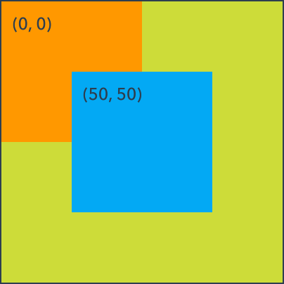
Every item has a position and a size. This is called its "geometry".
You set an item's geometry by assigning its x, y, width and height properties.
Rectangle {
    color: #lime
    Rectangle {
        width: 100
        height: 100
        color: #orange
    }

    Rectangle {
        x: 50
        y: 50
        width: 100
        height: 100
        color: #lightblue
    }
}
Coordinates
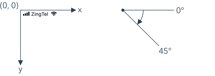
The Zing coordinate system begins in the top-left corner of the screen. The x-axis increases to the right, and the y-axis increases downwards.
Rotation is defined in degrees clockwise, with 0° along the x-axis.
Distances are given in "points". Zing uses the device's screen scaling factor to convert points into display pixels.
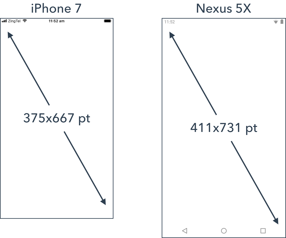
Android devices
Android devices use a surprisingly wide variety of screen scaling factors, and traditional Android design is often still done in pixels as a result.
Zing uses the scaling factor reported by the device to map between points and pixels. For example, the Nexus 5X uses a scaling factor of 2.625x, which gives its 1080p screen a point resolution of 411x731.
Expressions
Property expressions, and a bit of arithmetic, allow you to create powerful and dynamic layouts using just the x, y, width and height properties.
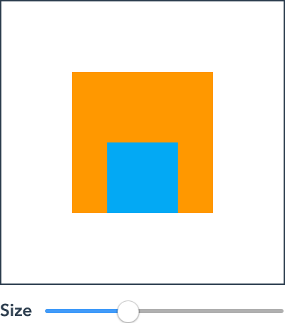
In the example below, the size slider varies the orange rectangle's size. The inner blue rectangle uses property expressions on its x and y properties to keep it fixed to the center of its container's bottom edge as the size changes.
Rectangle {
    width: 100
    height: 100
    color: #orange

    Rectangle {
        x: (parent.width - width) / 2
        y: parent.height - height
        width: 50
        height: 50
        color: #lightblue
    }
}

Transforms
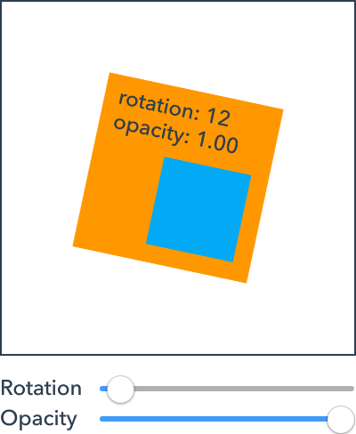
Items support three basic visual transforms: rotation, scale and opacity.
Rotation and scale
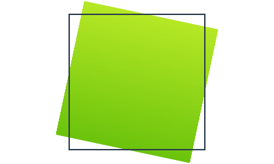
Items can be rotated and scaled by assigning the rotation and scale properties as shown below. The examples include the untransformed rectangular outline for reference.
Rotation is given in degrees clockwise.
Rectangle {
    rotation: 12
}
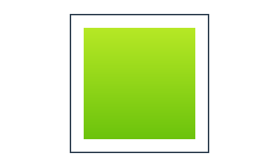
Scale is specified as a multiple. So a scale of 0.5 halves the size, and a scale of 2 doubles it.
Rectangle {
    scale: 0.8
}
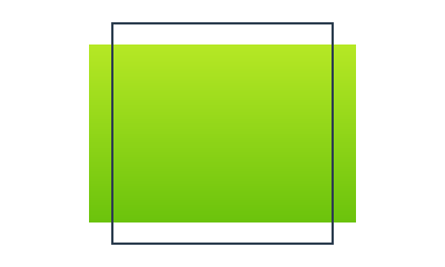
You can also scale the x and y axes separately using the scaleX and scaleY properties.
Rectangle {
    scaleX: 1.2
    scaleY: 0.8
}
For geometric transforms like rotation and scale, the point about which the transform is applied is important. For example, rotating 12° about the item's top left corner looks different than rotating 12° about its center.
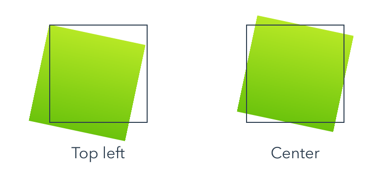
By default, Zing applies transforms about an item's center. You can change the transform origin to one of nine possible points by setting the Item.transformOrigin property.
Opacity
Assigning an item's opacity property adjusts its opacity. Valid values are between 0 (completely transparent) and 1 (completely opaque).
Image {
    opacity: 0.5
}
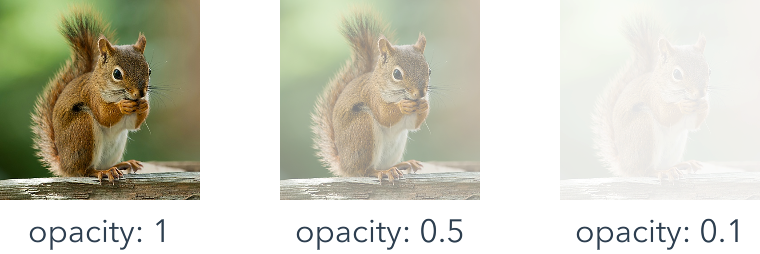
The item opacity is applied on top of its content's natural opacity. So, for example, a Rectangle with a translucent fill color or a translucent Image is made more transparent by the opacity property value, but does not magically become opaque when assigned an opacity value of 1.
Children
Every item can have children. Together items, their children, their children's children and so on form a visual tree that is drawn on the screen.
Grouping
An item's children are transformed relative to their container. When the container is moved or rotated, the children move and rotate with it. In a sense, an item behaves as a "group" for its children.
The sliders in the example below adjust the rotation and opacity of the orange rectangle. Adjusting either applies the effect to the entire group.
Rectangle {
    width: 100
    height: 100
    color: #orange

    Rectangle {
        x: 40
        y: 40
        width: 50
        height: 50
        color: #lightblue
    }
}
Clipping
While children are grouped with their container, by default they are not clipped to its size. Children are free to extend out the sides of their container, and do not even need to overlap it at all.
Rectangle {
    width: 100
    height: 100
    color: #orange

    Rectangle {
        x: 40
        y: 40
        width: 100
        height: 100
        color: #lightblue
    }
    Ellipse {
        x: -60
        y: 110
        width: 30
        height: 30
        color: #green
    }
}

To enable clipping, set the clip property.
Rectangle {
    width: 100
    height: 100
    color: #orange
    clip: true

    Rectangle {
        x: 40
        y: 40
        width: 100
        height: 100
        color: #lightblue
    }
}

Stacking
Conceptually, items are drawn on the screen one after another. If they overlap, items drawn later will appear on top of items that are drawn earlier.
By default, items are drawn in the order they are written in code and listed in the outline panel. So children are drawn above their container, and later siblings will overlap earlier ones.
The full story
An item always draws itself first, followed by each of its children.
Siblings - that is, items that share the same container - are ordered relative to one another according to two parameters: their child order and their stacking property value.
In simple terms, the child order is the order that items are written in your Zing code, and shown in the outline panel. More precisely, the child order is the position an item appears in its container's Item.children list. Later items, those with a higher child order, are drawn above earlier items.
The Item.stacking property value allows the child order to be overridden. Items with a higher stacking value will be drawn on top of siblings with a lower stacking value. If two siblings have the same stacking value, the child order is again used as a tie breaker.
Anchors
Anchors allow you to position items relative to one another. Anchors work by defining relationships between the edges of one item and the edges of another.
For example, the following anchors to top edge of rect2 to the bottom edge of rect1. Regardless of where rect1 is positioned, rect2 will be 20 points below it.
Rectangle as rect1 {
    color: #red
}

Rectangle as rect2 {
    anchor top = rect1.bottom + 20
    color: #orange
}

Anchors are convenient, but are just a shorthand for the equivalent property expressions, like that shown below.
Rectangle as rect2 {
    y: rect1.y + rect1.height + 20
    color: #orange
}
This is the general form of an anchor:
anchor Target Attribute = Source Attribute + Constant
Parent anchors
As it is so common, a shorthand exists for anchoring directly to an item's container.
If you are anchoring directly to the same attribute in the parent, you can omit the right hand side of the anchor entirely. For example, the following pairs of anchors are equivalent.
// Anchor to the right side of my container
anchor right
anchor right = parent.right

// Fill my container
anchor bounds
anchor bounds = parent.bounds
Edge attributes
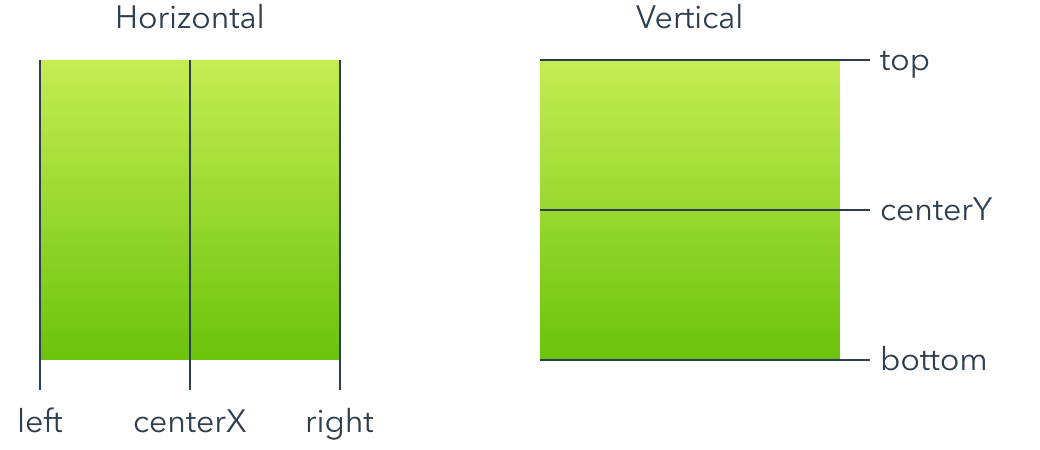
The six primary edges, three horizontal edges and three vertical edges, are shown below. Anchored edges must be on the same axis, so you can't anchor a horizontal edge to a vertical edge or vice versa.
You can anchor an item to any of its siblings, or to its container item. For example, you can achieve the example shown in the previous section using anchors like this:
Rectangle {
    width: 100
    height: 100
    color: #orange

    Rectangle {
        anchor centerX = parent.centerX
        anchor bottom = parent.bottom
        width: 50
        height: 50
        color: #lightblue
    }
}
Anchors and property expressions can be mixed where they don't conflict. In the example above, we used the width and height properties to specify the size and used anchors to set the position.
Anchors can be chained together to create more complex layouts.
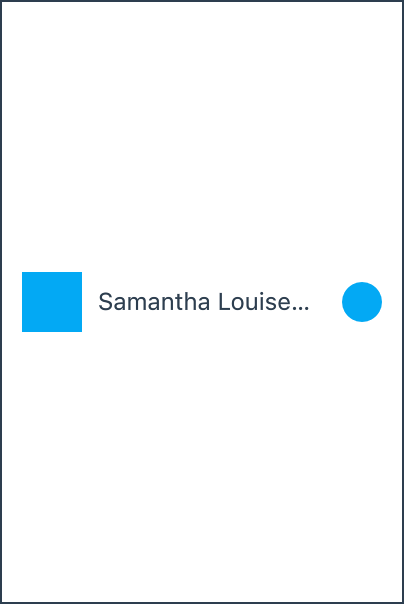
Rectangle as icon {
    anchor left = 10
    color: #lightblue
}

Text as name {
    anchor left = icon.right + 8
    anchor right = more.left - 8
    text: "Samantha Louise Applebee"
}

Ellipse as more {
    anchor right = parent.right - 10
    color: #lightblue
}
Size attributes
The two size attributes, width and height, are shown below.
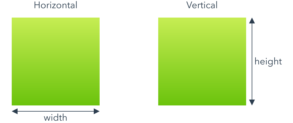
Like with edge attributes, you can anchor an item's size to any of its siblings, or to its container item.
You can also include a scale factor when anchoring a size attribute. For example, the following anchor sets an item's width to half its container width plus 20.
anchor width = 0.5 * parent.width + 20
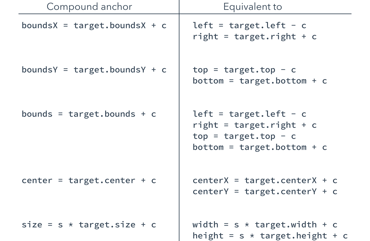
Compound attributes
In addition to the primary anchor attributes, there are five compound attributes that allow you to anchor to the bounds, size or center of an item more concisely. Compound attributes are just a convenience and are equivalent to anchoring multiple primary attributes at once.
Bounds anchor constants
A positive constant in a bounds anchor expands the bound about each edge, and a negative constant shrinks it. Think "plus makes it bigger" and "negative makes it smaller".
Rectangle {
    color: #orange

    Rectangle {
        anchor bounds = parent.bounds - 20
        color: #lightblue
    }
}

Design view
The design view understands the anchors you declare in your code, and anchored items are positioned correctly. However, when adding and manipulating new items, a simplified version of the anchor model is presented in the user interface.
The simplified geometry pane allows you to quickly construct and modify a layout by focusing on the essentials. If you require additional refinements, you can switch to the code view to add them.
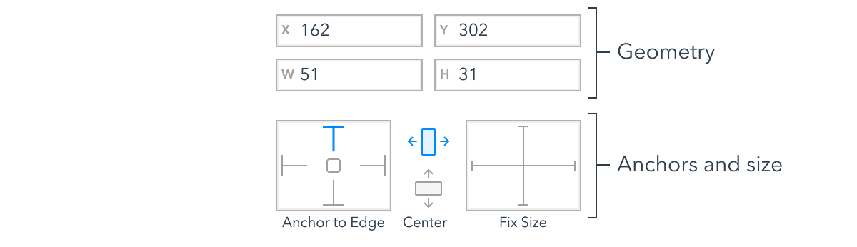
The geometry pane is found at the top of the property panel when an item is selected in the design view. An example is reproduced above.
Geometry
The x, y, width and height fields show the values for the item's geometry.
If you modify these values, Zing will try and make the change by adjusting the current anchors. For example, if you modify the x field for the following item, Zing would adjust the right anchor's constant instead of assigning the x property directly.
Ellipse {
    anchor right = parent.right - 20
}
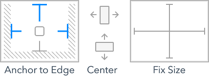
Anchors and size
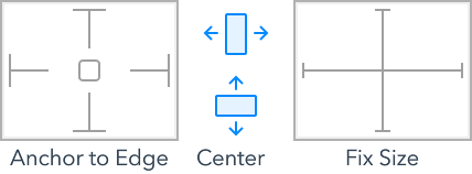
The anchors and size section shows the anchor and sizing contraints applied to the item. The struts and icons are toggles, with blue indicating enabled and gray disabled.
Each strut in the "anchor to edges" diagram represents an anchor from the item to its container. If the strut is enabled, the item is anchored on that edge.
The "center" icons represent horizontal and vertical centering anchors. When the icon is enabled, the item is centered, relative to its container, on that axis.
The "fix size" struts indicate whether or not an item has been assigned an explicit width or height. If the strut is enabled, the item has an explicit size. If it is disabled, the item is either using its implicit size or its size is a side effect of the anchors applied.
Lets look at some examples.
The simplest case is assigning basic values to the x and y property.
Material.Spinner {
    x: 90
    y: 100
}
While not syntactically anchors, as items are positioned relative to their container, assigning an explicit position is effectively "anchoring" it to the top and left edges of its container.
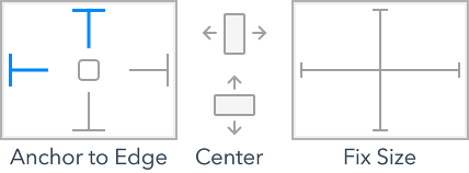
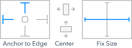
Of course, you don't need to use the same "class" of anchor on both axis. The next example uses an edge anchor to set the item's y position, while using a center anchor to horizontally align itself.
Apple.Switch {
    anchor centerX
    anchor bottom = parent.bottom - 10
}
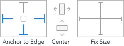
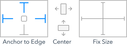
When multiple sides of an item are anchored, either directly or as part of a compound anchor, the anchor to edge struts are enabled accordingly.
Material.TextField {
    anchor boundsX = parent.boundsX - 20
    anchor bottom = parent.bottom - 80
}
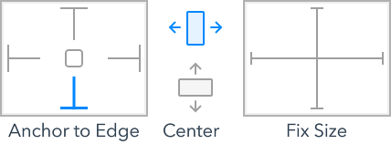
Equally, the compound centering anchor also enables both the horizontal and vertical center icons.
Apple.Spinner {
    anchor center = parent.center
}
The final example assigns the item an explicit width value. Here we see the horizontal fix size strut enabled for the first time. In all the previous examples, the width either came from the element's implicit size or from the anchors applied to it.
Apple.TextField {
    x: 40
    width: 120
}
Setting constraints
As you position items in the design view, Zing will apply some simple anchoring rules automatically. However, you aren't stuck with the default choices Zing makes.
The struts and icons in the geometry view can be toggled by clicking on them. When you change constraints, Zing will update the anchors used and choose appropriate offset values to ensure that the item's current geometry doesn't change in the process.
The following video shows the process of positioning and anchoring a search field. It is easy to start out with a rough position and size, and then refine its geometry and anchors until they meet your needs.
The code created for this layout is shown below. In this example, the left and right anchors have been replaced with a single boundsX anchor. Where possible Zing will collapsed multiple individual anchors into compound anchors to increase the code's readability.
Material.SearchBox {
    anchor boundsX = parent.boundsX - 20
    y: 20
}
Layout containers
Layout containers are items that automatically position their children according to some rule. Layout containers are useful when you have a number of regularly arranged items, such as icons in a row or column.
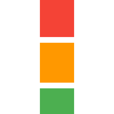
Column {
    spacing: 10
    Rectangle {
        width: 60; height: 80
        color: #red
    }
    Rectangle {
        width: 60; height: 70
        color: #orange
    }
    Rectangle {
        width: 60; height: 60
        color: #green
    }
}
Zing includes four layout containers. Row, Column and Grid position their children in a single row, single column and fixed grid respectively. Flow positions its children from left to right, wrapping to a new line when it runs out of space.
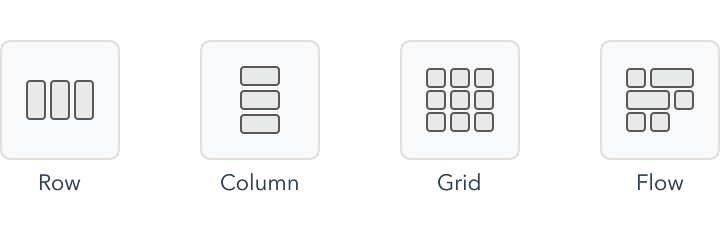
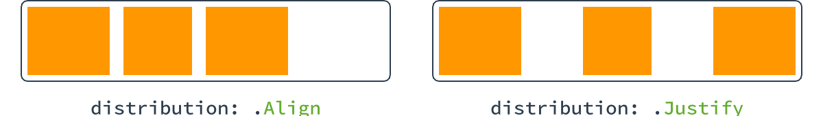
The layout container elements provide configuration properties to adjust their exact layout behavior. For example, the Row.distribution property controls how the children are distributed in the row.
Layout containers can also be nested to create more complex layouts.
Design view
Layout containers and their children can be added in the design view like any other element.
To simplify their use even further, the design view provides smart actions to add groups of existing items into a layout container. For example, if you select three items that are already roughly aligned in a row, a smart action suggestion appears to group them into a row.
Layouts position items in their child order. Reordering children in the Outline view will effect their order in the layout container. You can also reorder the items directly by dragging them to their desired position in the layout.
Safe area
Safe areas help you place your items within the visible portion of the overall interface. Elements, or the system itself, may position special items on top of your content. For example, on iOS the system displays a status bar, and possibly a home indicator, on top of your fullscreen view content. Even when these overlays are partially transparent, they still occlude the content that is underneath them.
Put simply, an item's safe area is the rectangular region within the item where it is safe to position children such that they wont be obstructed or difficult to access. The safe area is an aid to laying out your content.
Screen decorations
Screen decorations such as the status bar, Android navigation bar, iOS home indicator, and any notches the device has are overlayed on top of your fullscreen items.
This allows you to prototype immersive designs that extend right up to the screen edge, but means that almost every fullscreen view is impacted by a safe area.
For example, here are the full screen safe areas on the iPhone XS and Nexus 5X. If you place content outside the safe area, it will still be visible, but will partially obscured.
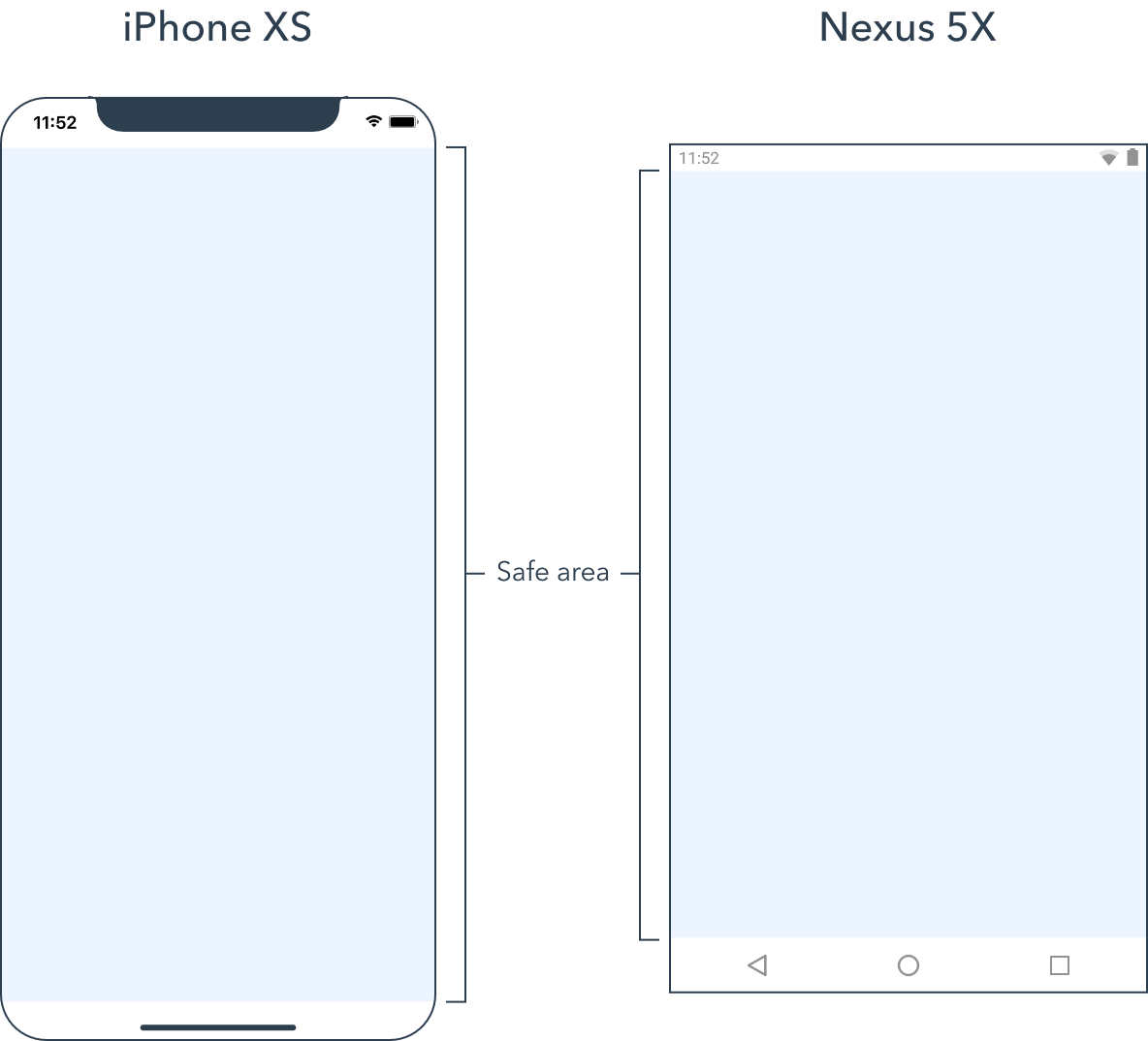
Hiding the status bar will cause the safe area to extend to the top of the screen on the Nexus 5X, but it will unchanged on the iPhone XS due to the screen notch.
UI overlays
Some elements position translucent overlays on top of your content.
For example, the Apple.TabView element adds a tab bar control on top of each tab page. As the tab bar is not opaque, the tab pages still fill the full size of the tab view so that their background can be partially seen through the tab bar.
Calculation of an item's safe area is cumulative, so if there are additional overlays, such as a status bar, they may further detract from a tab page's safe area.
Anchors
The easiest way to create safe area aware layouts is with anchors.
For each regular anchor attribute, there is a corresponding source attribute for the item's safe area.
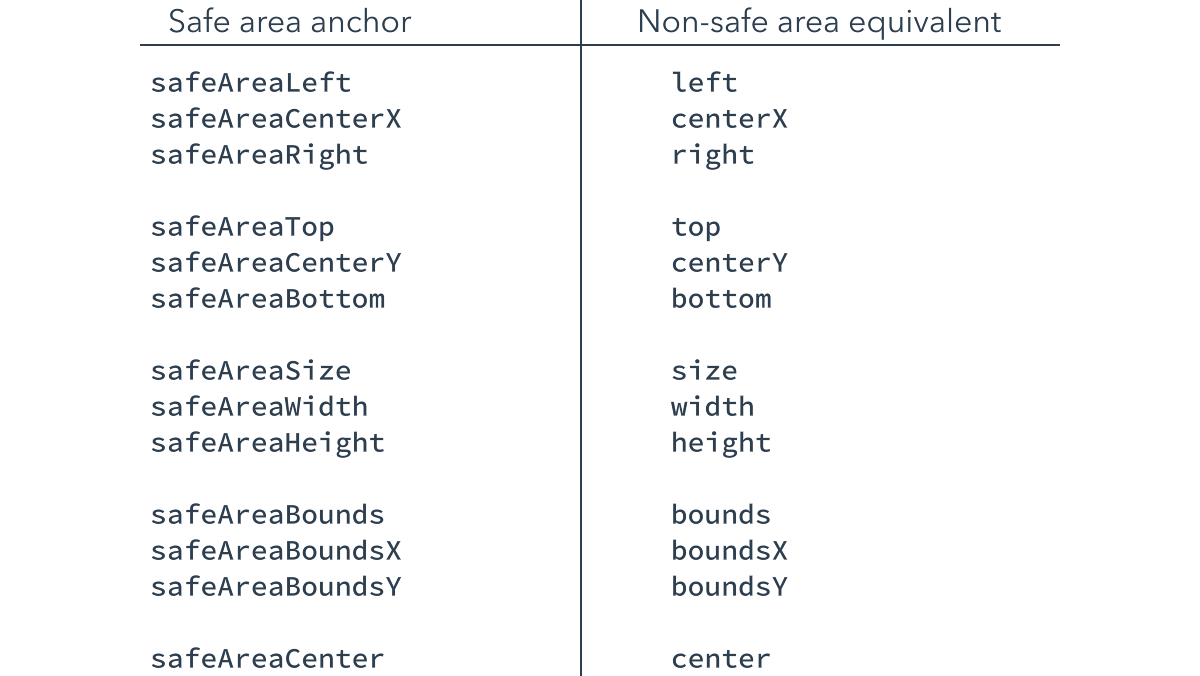
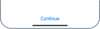
In most cases, you will be anchoring to the container's safe area. For example, the following code shows how to anchor a continue button to the bottom of its container's safe area. Had it anchored to the absolute bottom of its container, it would be obscured by the home indicator on modern iPhones.
Apple.Button {
    anchor bottom = parent.safeAreaBottom
    label: "Continue"
}
Safe area attributes can only appear on the right hand side of an anchor statement.
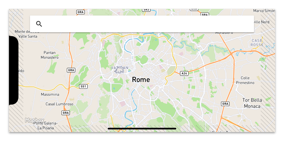
Design view
In the design view, a diagonal stripe pattern is drawn in the region outside of an item's safe area. This allows you to visualise the item's safe area and easily position its children.
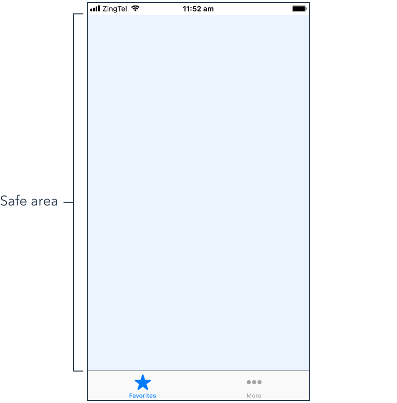
For example, the safe area of a landscape iPhone XS looks like this.
The geometry pane can also anchor to a container's safe area insets. When a safe area inset is available for anchoring, the stripe pattern is shown in the geometry pane for that edge.
When you tap the edge inset strut, it cycles between the three available states - disabled, anchored to safe area inset and anchored to the outer container edge.
Material.SearchBox {
    anchor boundsX = parent.safeAreaBoundsX - 20
    y: 20
}
If you want to anchor to the container's safe area and the inset isn't an option in the geometry pane, you can hold the ⌘ key to force it to appear.
If you want to anchor to the container's safe area and the inset isn't an option in the geometry pane, you can hold the Ctrl key to force it to appear.
Effects
Zing includes a number of visual effects, such as tints, shadows and blurs. The effects are broadly split into two categories - item effects and blur layers.
Item effects
Most effects are "item effects". These effects are not items themselves, but are applied to other items.
Item effect elements are called "extension elements" because they extend the behavior, in this case the visual appearance, of the item they're applied to. Extension elements are applied to an item using the with keyword, like this.
Image {
    source: "squirrel.png"
    with Effect.Sepia {}
}

Effects are applied to the item and its children.
Zing includes five item effects.
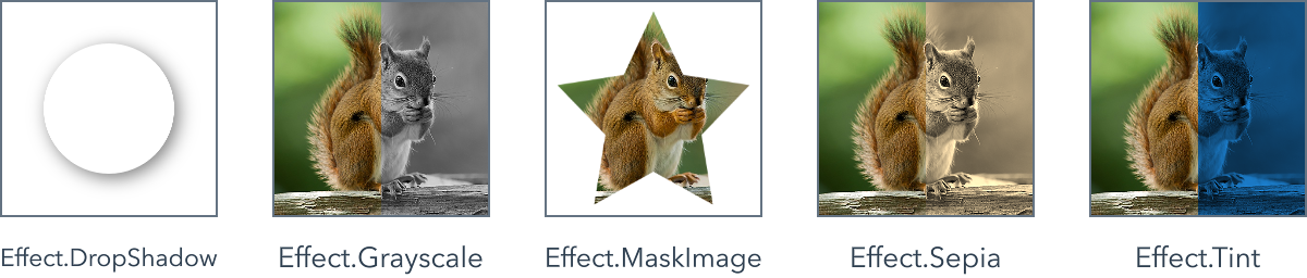
Blur layers
Blur layers are distinct from other effects as they are actually items themselves. A blur layer works like any other item, but instead of drawing content itself, it blurs the items "behind" it.
Apple.Switch {}

Effect.BlurLayer {
    anchor bounds
}
Zing includes two blur layer effects.
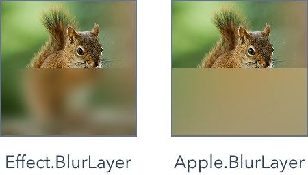
Images, fonts and colors
Images
Zing supports a wide range of raster image formats. As support can vary between devices, we recommend you stick to PNGs and JPEGs to ensure your prototype runs in as many places as possible.
Prototypes can load image files from within your project, or from a network URL. To load a network image, just provide the full URL, like the example shown below.
Image {
    source: "http://www.zingstudio.io/demos/image6.jpg"
}
Symbols
Zing also supports vector symbols, which can be used in place of bitmaps in buttons, list and tab items or anywhere else a regular image is accepted.
Follow the links below to the websites of the three large symbol libraries included with Zing Studio - Apple's SF Symbols library, Google's Material Design icons and the community created Material Design symbols
Symbols are referenced using a special internal URL scheme that begins with the ":" character, like that shown below.
Image {
    source: ":/Apple/Symbol/flame"
}

While symbol URLs code complete just like regular file URLs, the easiest way to create a symbol URL is to use the built in Symbol Browser tool. The Symbol Browser allows you to search the available symbols, as well as configure symbol parameters such as their weight, scale and size.
You can access the Symbol Browser through the "Window » Tools » Symbol Browser" menu, or using the following keyboard shortcut.
You can access the Symbol Browser through the Zing Studio "Tools » Symbol Browser" menu, or using the following keyboard shortcut.
Symbol Browser shortcut
Symbol Browser shortcut
High DPI images
The coordinate system Zing uses is based on points, which map to pixels on the display.
A standard resolution display has a 1:1 pixel density, where one pixel corresponds to one point. High resolution displays can have a higher pixel density, offering a scale factor of 2x or even higher. High resolution displays require images with more pixels to avoid appearing blurry.
For example, suppose you have a standard resolution image that's 10px x 10px. The 2x version of this image would be 20px x 20px.
By default, Zing assumes images are at 1x scale. To provide a 2x image to Zing, you can either append "@2x" to its filename, or open the image in Zing Studio and select the "High DPI image" option.
Image {
    source: "[email protected]"
}
Zing will automatically optimize your 2x images to work on all display densities.
Resizable images
Normally when an image is resized, the pixels are stretched evenly, uniformly deforming the image.
However, sometimes we want to resize the image non-uniformly - with some areas stretching and others remaining fixed in size. These images are often called "nine patch" images.
Consider the following image.
If we simply stretch this image normally, it becomes distorted and looks horrible.
To fix this, we can mark the horizontal and vertical areas of the image we want to remain fixed, by opening the image in the Zing Studio and switching to the "Stretching" view.
Now when the image is resized, it behaves as we would expect and the corners, notch and shadow remain undistored.
Android 9-patch files
Zing can load resizable images in the Android 9-patch file format. Android 9-patch images are functionally equivalent to other resizable images, but are created by the Android "Draw 9-patch" tool.
Android 9-patch files are identified by a ".9" suffix added to their filename.
Image {
    source: "circle.9.png"
}
In the case of a high DPI image, the "@2x" should come after the ".9".
Image {
    source: "[email protected]"
}
Fonts
To ensure that your project text has a consistent appearance across different computers and devices, it is safest to copy the fonts you use into your project.
If you use a font installed on your Mac that isn't bundled with your project, you risk Zing having to use a different font when run on a computer or device where that font isn't available.
If you use a font installed on your PC that isn't bundled with your project, you risk Zing having to use a different font when run on a computer or device where that font isn't available.
Zing includes the iOS and Android system fonts, San Francisco and Roboto respectively, so these are already available on all platforms and devices.
To add a font to your project, copy the font file into the project's font folder. Zing supports the following font file types:
The easiest way to copy the font file is to drag it from a Finder window and drop it into the Zing Studio project browser.
The easiest way to copy the font file is to drag it from an Explorer window and drop it into the Zing Studio project browser.
Project font names are automatically added to the font picker and font name code completion. You can see a complete list of all the available project fonts in the Fonts tab of the Fonts and Colors project view.
Color
Colors are 32-bit, RGBA values encapsulated by the Color value type. Zing operates in the sRGB color space.
You can explicitly specify a color directly in the #RRGGBB hexidecimal format.
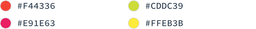
An optional alpha value can be provided in the #RRGGBBAA format.
Zing Studio also provides a number of named colors and allows you to define custom colors to use in your project.
Builtin colors
There are fifty-seven builtin color names.
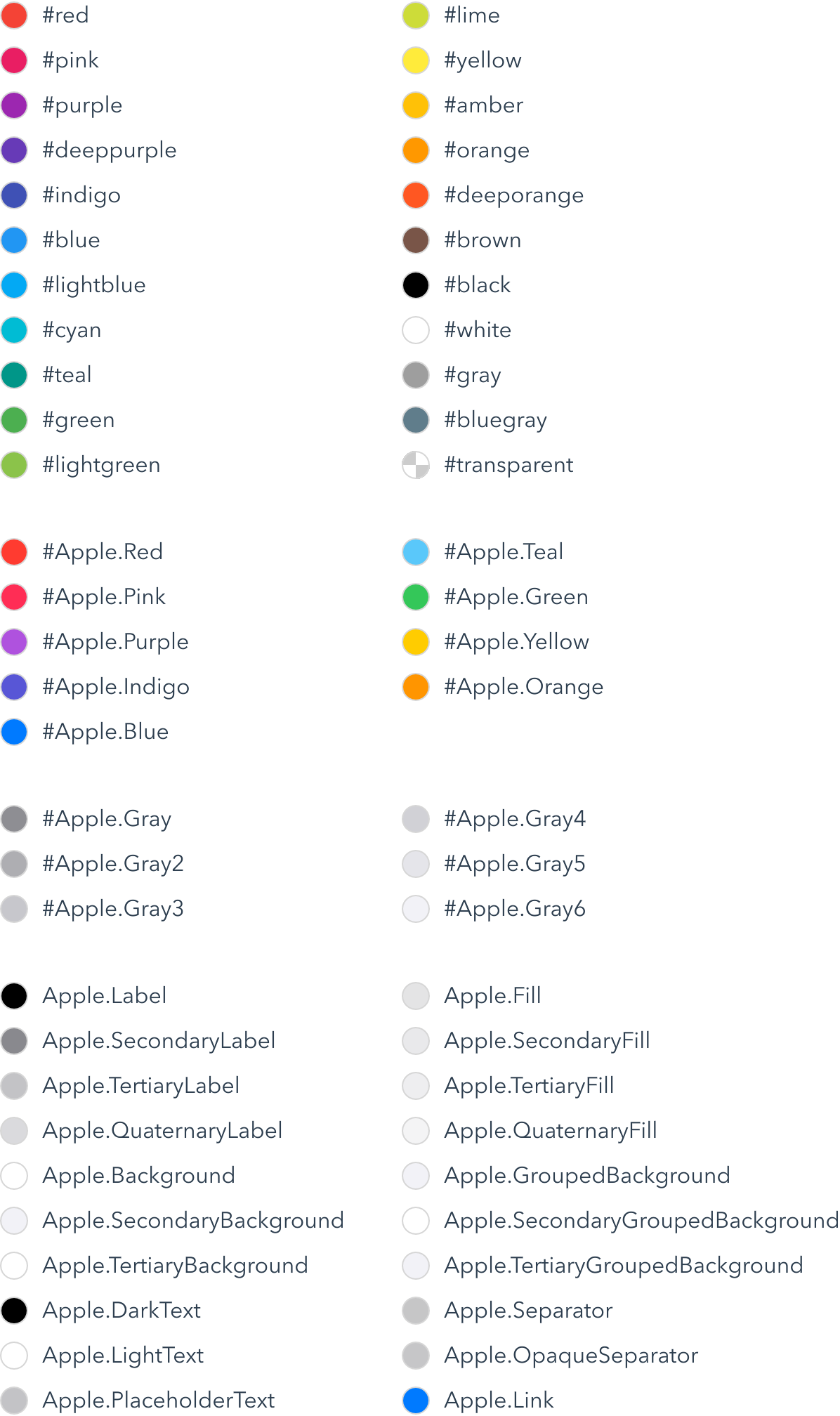
Project colors
You can view and manage the colors used in your project in the Fonts and Colors view.
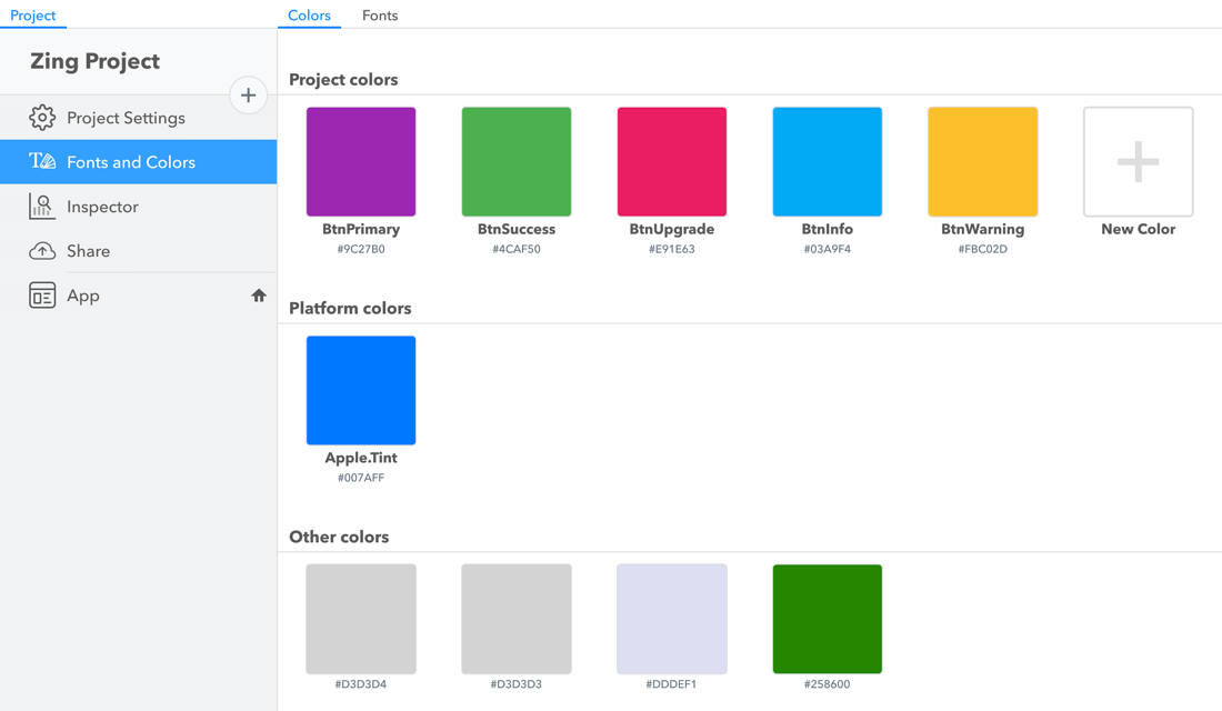
As shown, the color manager splits colors into three groups - Project, Platform and Other colors.
Project colors are custom colors you've added to your project. Project colors appear alongside the builtin color names in color pickers and code completion.
To add a new project color, tap the "New Color" button and give it a name.
To change the color value, tap on the swatch to show a color picker, or just edit the hex value directly. You can also rename a project color by editing the name field.
You can duplicate or delete a project color by right clicking its color swatch.
Platform colors are used as defaults by the Apple and Material platform elements. Changing the platform color makes it easy to apply an overall theme to your prototype without having to set every individual element property.
You can reset a platform color to its default value by right clicking its color swatch.
Finally, the other colors section lists all the colors in your project that were written as explicit hexidecimal values. You can convert an unnamed color into a project color by tapping on it and giving it a name.
Views
Most prototypes will need to show more than can be fit into a single view.
Conceptually your prototype is a stack of one or more fullscreen views.
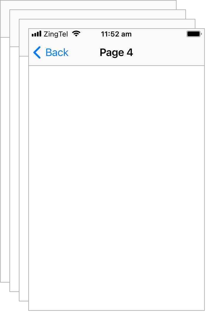
You add a new view to the stack by pushing it or by presenting it.
Pushing
Pushing a view navigates from the current view to the new view. You push a view with the View.push() method like this:
Apple.Button {
    label: "Push Page 2"
    on activated {
        View.push(Page2)
    }
}
Pushing is usually used to navigate a view heirarchy, and creates a "back" relationship between the pushed view and the pushing view. Pushed views are always maximized and replace the previous view.
As shown above, when the pushed views have Apple.NavigationBar headers, a back button and an appropriate header transition is added as expected.
Presenting
Presenting a view displays it modally. You present a new view with the View.present() method like this:
Apple.Button {
    label: "Present Page 2"
    on activated {
        View.present(Page2)
    }
}
The difference between pushing and presenting a view is subtle. In addition to using a different default transition, presented views do not have an automatic back button, so must include some way to dismiss the view, such as a done button.
Presented views are not always maxized. By setting the View.presentationStyle extension property on the view, you can choose how the view is presented. The following example shows the FormSheet presentation style. You can see all the presentation styles in the View.PresentationStyle documentation.
Apple.Button {
    label: "Present Page 2"
    on activated {
        View.present(new Page2 {
            View.presentationStyle: .FormSheet
        })
    }
}
Dismissing
You dismiss a view with the View.dismiss() method like this:
Apple.Button {
    label: "Done"
    on activated {
        View.dismiss(root)
    }
}
You pass the root item in the view to dismiss as a parameter to the dismiss() method. If an item that wasn't push()'d or present()'d is passed, it will have no effect, and Zing will log a message explaining the mistake.
ScrollView
The ScrollView element allows large content to be scrolled. When the dimensions of the ScrollView's children exceeds its own size, the ScrollView enables scrolling in the appropriate direction.
ScrollView {
    width: 320
    height: 480

    InfoPane {
        width: 320
        landmark: "Royal Albert Hall"
        city: "London, England"
    }
}
As the InfoPane child element is taller than the ScrollView, it is allowed to scroll vertically. The ScrollView can also have multiple children, in which case the bounds of all the children are used to determine the scroll dimensions.
User elements
Elements are the foundational building blocks of Zing. They are the components of the Zing world. In the examples so far you have assembled the builtin elements to create simple prototypes.
You can also build your own elements. Elements you build yourself are used in the same way as the builtin elements. Anywhere you can use a builtin element you could also use a custom element you have made.
New elements are made just like the rest of your prototype - by combining existing elements and logic code to create something new. This is simple, but also extremely powerful. For example, the Apple.Slider control shown below is actually built out of two Rectangles and an Image. Hover over it to see the constituent elements.
Elements are extremely versatile. You can build elements for user interface controls you require, such as the slider example shown above. You can also build elements for smaller fragments of your UI. For example, if you are building a music app, you might create an element for a track cell.
Elements are also great for splitting your project into more managable pieces, allowing you to work on parts of it in isolation. In most cases each fullscreen view in your prototype should be its own element.
Elements don't need to be big and complex. It is perfectly fine, although perhaps a little extreme, to create a RedText element that is made of a single Text element like this.
| From RedText |
Text {
    color: #red
    font: "San Francisco"
    size: 22
}
When you use the RedText element in your project, it behaves exactly like regular Text, except it is red (and larger) by default.
Image carousel
Image Carousel is a concrete example prototype that demonstrates how you can use custom elements. It looks like this.
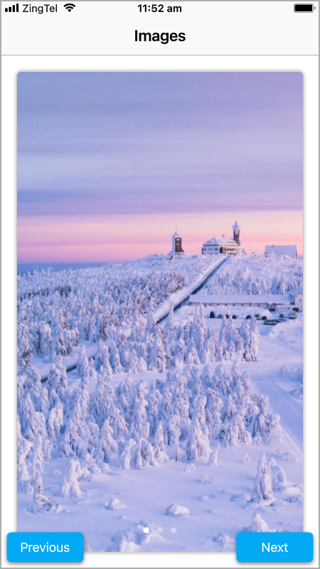
The project is made up of three user elements - App, Button and ImagePage. The project's custom elements are shown in the project explorer. You can create a new element by clicking the plus icon and entering its name.
In the same way as you drag builtin elements out of the Element Library and drop them on the canvas, you can drag users elements out of the project explorer. Try adding a Reset button between the Previous and Next buttons that scrolls back to the first carousel page.
The Button element is used for the previous and next buttons in the bottom corners of the prototype.

The ImagePage element displays an image from the network within a frame and shows a busy indicator while it is loading. A standalone ImagePage is shown below.

Finally, the App element provides the prototypes' main view and logic, by combining two buttons and three image page's to create the completed example.
Home element
The App element is the main view of the Image Carousel example. The small home symbol next to it in the project explorer indicates that it is the "home element".

Even though it has an important sounding name, there is nothing special about the App element. From Zing's perspective it is just another element. If you rename the App element, it continues to work the same.
The home element is the element that Zing shows when it previews your prototype. This is a subtle, but important, detail. Zing doesn't "run" your prototype - it just creates an instance of the home element and displays it on the screen. Zing really is elements all the way down.
You can make another element the home element by activating the home icon that appears when you mouse over it. Try switching between the three elements in the Image Carousel project to see how the preview changes.
Element interface
The root object in your custom element is called the element's "base" type. The custom element is said to extend the base element type.
The skeleton code for an example Button element is shown below. In this case, the Button extends the Rectangle element.
| From Button |
Rectangle {
    Text as label {
        text: "Button"
    }
}
When you build an element you can set any internal property that you need, like the label's text. However, when you use the element you can only access the properties that are on the root object of the element. For example, this is OK,
Button {
    color: #blue
}
but this is not:
Button {
    text: "Press Me" // Error: Unknown property
}
If a property isn't on the root of your element, it can't be accessed outside the element itself. There is no way to "reach into" an element from the outside and change an arbitrary property. Only the details of your element that you choose to expose are available from the outside.
An element's properties, events and functions are collectively called the element's "interface". In order to build powerful new components you can add new properties, events and functions to your elements.
Properties
You declare new properties like this:
Item {
    property Int count
    property String name
}
You can add new properties to any object in an element. The properties declared on the root object of an element become part of the its interface. Properties on other objects can store values used in your code.
Properties can also be marked as private or readonly.
Item {
    private property Int internalProperty
    readonly property String readonlyProperty
}
A private property is only visible within the file it is declared in. To code outside that file it is as though the property doesn't exist.
A readonly property can only be modified by code within the file it is declared in. To code outside that file, it's value can be read but not modified.
Events
You add events to your own elements like this:
Item {
    event pressed()
    event pressedAtLocation(Float x, Float y)
}
If the event is declared on the root object, it becomes part of the element's interface.
Events can be marked as private.
Item {
    private event internalEvent()
}
A private event is only visible within the file it is declared in. To code outside that file it is as though the event doesn't exist.
When an event includes arguments, such as the x and y position shown above, you can access them by adding argument receivers to your event handler:
on pressedAtLocation(xPosition, yPosition) {
    System.log("Pressed at", xPosition, yPosition)
}
The names you choose for the event arguments, in this case x and y, are used for code suggestion to communicate what the receiver is for, but can be overridden by event handlers.
To fire an event, you call it like a function.
root.pressedAtLocation(10, 11.1)
Functions
You can add functions to your own elements like this:
Item {
    // "myFunction" takes no arguments
    function myFunction() {
        System.log("myFunction called")
    }

    // "myFunction1" takes a single int argument
    function myFunction1(Int arg1) {
        System.log("myFunction1 called with", arg1)
    }

    // "myFunction2" takes a String and a Rectangle
    // and returns a Bool
    function myFunction2(String arg1, Rectangle item) -> Bool {
        return true
    }
}
You can add optional arguments to your functions using the optional keyword. Optional arguments should appear after all the ordinal arguments.
Item {
    // "myFunction" takes a single optional arg named "optionalArg"
    function myFunction(optional Int optionalArg) {
        System.log("myFunction called with", optionalArg)
    }

    // "myFunction1" takes a single mandatory int argument and an
    // optional arg named "optionalArg"
    function myFunction1(Int arg1, optional Int optionalArg = 9) {
        System.log("myFunction called with", arg1, optionalArg)
    }
}
If the caller doesn't pass a value for an optional argument, the type's default value will be used instead. You can override this by providing a default value expression for an optional argument, as shown in the "myFunction1" example above.
Functions can be marked as private.
Item {
    private function internalFunction() {
        System.log("internalFunction called")
    }
}
A private function is only visible within the file it is declared in. To code outside that file it is as though the function doesn't exist.
Aliases
An alias creates an alternative name for an existing property, event, function or object for use in an element's interface.
Often when building a element, you need to expose a property of an internal object. Creating an alias does this - it creates a new property on the root object that behaves exactly like the alias target. Reading or writing to the alias is equivalent to performing the operation directly on the alias target.
The simplified Button element below uses aliases to add a label property and an activated event to its interface.
| From Button |
Rectangle {
    alias label: label.text
    alias activated: tapGesture.tapped

    Text as label {
        text: "Button"
    }

    with Gesture.Tap as tapGesture {}
}
Once the aliases are in place, we can use them to configure the Button, and be notified of when it is tapped.
Button {
    label: "Tap Me!"
    on activated {
        System.log("Tapped!")
    }
}
Aliases can target almost anything - properties, events, functions and even entire objects. For example, instead of just aliasing the label's text, we could expose the entire internal Text object itself.
| From Button |
Rectangle {
    alias label: label
    alias activated: tapGesture.tapped

    Text as label {
        text: "Button"
    }

    with Gesture.Tap as tapGesture {}
}
This gives us full access to the internal object, allowing us to change any property we want. Try modifying the Alias Example project to work like this.
Button {
    label.text: "Tap Me!"
    label.font: "San Francisco Italic"
}

Static properties
Most properties, functions and events are instance members. That is, each instance of an element has a separate copy of each.
For example, a property stores a distinct value for each instance of an element. A function called on a specific element instance has access to all these property values.
There is a second class of properties, functions and events known as element, or "static", members. In this case, there is only a single copy of their value which is shared across the entire application. Element members can be thought of as "global" or "shared" members.
For example, you would use an instance property to store the number of times a specific Button had been clicked, but you would require a static member to store the number of times all the Buttons in your application had been clicked.
Static members are declared just like regular members, but preceded by the static modifier keyword. To access a static member you use the element name directly, rather that use an element instance reference.
The following example shows how to use a static property.
| From Button |
Rectangle as root {
    static property Int totalClicks

    // ... Button code...

    on clicked {
        // Correct - increment element property
        Button.totalClicks++

        // Error - not an instance property
        root.totalClicks++
    }
}
Declaring and emitting a static event is very similar to a regular event as shown below.
| From Button |
Rectangle as root {
    static event buttonClicked(Button instance)

    // ... Button code...

    on clicked {
        Button.buttonClicked(this)
    }
}
As static events aren't associated with a single instance, you can add an event handler for a static events anywhere in your project. You add static event handlers at the root level of a file, like this:
Item {
    // ...code...
}

on Button.buttonClicked(instance) {
    System.log("Button {1} clicked!".arg(instance.label))
}
As a static function is not associated with any specific instance of an element it can't access any instance properties directly. Instead it only has access to other static members and any values passed to it as parameters.
Animation
There are three main ways to achieve animation in Zing - immediate animations, constructed animations and state transition animations. This section will describe immediate animations and animation elements. You can learn more about state transition animations in the State Machines chapter.
Immediate
You can animate a property using the Animation.tween() method. Animation.tween() is suitable for simple animations where you are animating a property to a new value.
The Animation.tween() method takes two arguments. The first is the property to tween, and the second is the value to tween to. The following example tween's the rectangle to a new color each time you tap it.
Rectangle as rect {
    on Gesture.tapped {
        var color = Color.random()
        Animation.tween(rect.color, color)
    }
}

Tweening works with any property that is a tweenable type - either Int, Float or Color. You can add a delay to the tween, or specify the duration and easing curve using optional parameters. Learn more from the Animation.tween() reference documentation.
Constructed
Touch
You use gesture recognizers to add touch input to your Zing prototypes. Gesture recognizers translate raw, multi-touch input sequences into meaningful gestures like tap, pan and pinch.
Zing includes builtin support for eight different gestures.
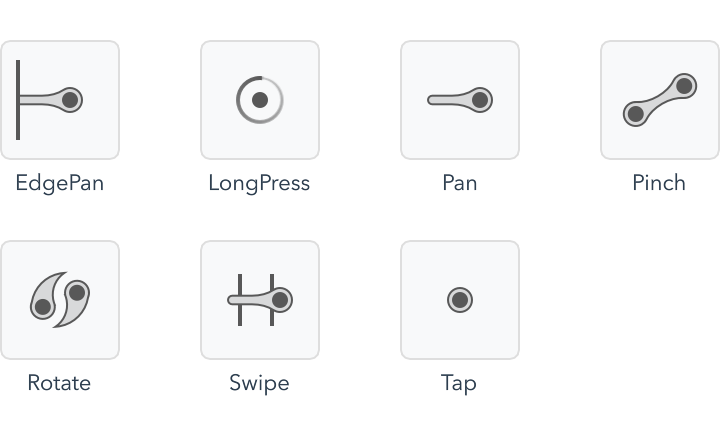
Gesture recognizers are not themselves items. Instead, they are a special kind of element called an "extension" element. Extension elements are used to add or modify the behavior of another kind of element. Extension elements work just like other elements, but are applied to their container using the "with" keyword.
Rectangle as rect {
    with Gesture.Tap {
        on tapped {
            rect.color = Color.random()
        }
    }
}

You can apply a gesture recognizer element to any item in your prototype. The item you apply to recognizer to defines the bounds that the gesture will be recognized within.
By themselves the elements simply recognize the gesture, and fire events for your code to handle. It is up to you to decide what happens when the events fire.
There are two classes of gestures, discrete and continuous. A discrete gesture, such as Gesture.Tap or Gesture.Swipe, occurs but once in a multi-touch sequence and results in a single event being emitted. However, when a continuous gesture, such as Gesture.Pan or Gesture.Pinch, is recognized an event is fired for each incremental change until the gesture concludes.
You can add multiple gestures and they will resolve the touch input appropriately. The following example adds an additional right swipe gesture to reset the rectangle to its initial #lightblue color.
Rectangle as rect {
    with Gesture.Tap {
        on tapped {
            rect.color = Color.random()
        }
    }

    with Gesture.Swipe {
        on swiped {
            rect.color = #lightblue
       }
    }
}

Custom gestures
Most touch interactions can be handled by combining the builtin gesture recognizers. These recognizers are well tuned to match the gesture behavior users already expect.
However, if needed you can implement your own custom single- and multi-touch gestures.
Gesture.MultiTouch provides direct access to the raw, multi-touch input and allows you to implement any gesture you can imagine. All of the builtin gestures can be implemented using Gesture.MultiTouch.
Gesture.SingleTouch provides an easier interface for implementing single touch gestures. Of course, single touch gestures can also be implemented using Gesture.MultiTouch directly.
Interactions
Interactions are gestures that also perform an action. For example, the Interaction.Button interaction fades its container item when it is pressed. Interactions allow you to prototype more rapidly, but may not provide the exact behavior you want.
Asynchronous code
Zing includes asynchronous APIs for functionality that might take an extended time to complete, such as network activity.
Task
A Task is a generic value type that represents an ongoing, asynchronous operation that will complete in the future.
The Task's isReady property is used to determine if the asynchronous operation has completed, and the Task's value property contains the result of the operation when it has.
The Task type is a generic container type. This means that it can be specialized to hold different result types. For example, you can have a Task that holds an Int result value, or a Task that holds a HttpResponse result value.
You declare a Task variable in the same way as other generic types, such as arrays and dictionaries, using the angle bracket syntax to specify the type that it holds. For clarity we specify all the types explicitly in the following examples, but in real code you would usually use var and let type inference do all the work.
Task<Http.Response> task = Http.get("http://www.google.com")
// Don't worry about all the typing, you can also write:
// var task = ...

if (task.isReady) {
    Http.Response response = task.value
    System.log(response.body)
}
Unfortunately, this example is pretty useless as the Task returned by the HTTP get method will never be ready right away and none of the precious code inside the if body will ever run.
To make it useful, we use the await operator to wait until the task completes and the result is available.
Task<Http.Response> task = Http.get("http://www.google.com")

await task

if (task.isReady) { // Always true, thanks to the await
    Http.Response response = task.value
    System.log(response.body)
}
The await operator doesn't just wait for the Task to complete, as a convenience it also returns its value. This allows us to simplify the code by assigning from the result of the await operator directly, like this:
Task<Http.Response> task = Http.get("http://www.google.com")

Http.Response response = await task
System.log(response.body)
async functions
The previous section glossed over exactly what happens when the await operator waits.
When an await is encountered, the state of the running function is captured as a continuation on the Task and the function returns to its caller immediately. A continuation is a special representation of the execution state of the function which allows it to be suspended and resumed later. When the awaited Task completes, the continuation thaws out the function and resumes running it like nothing happened, only now the Task is ready and its value available.
When you call a function that awaits, you are starting an ongoing operation that will complete in the future. It should be no surprise that when the awaiting function returns to its caller, it returns a Task that represents this new operation. This returned Task will become ready only after the awaiting function has resumed and ultimately completed its execution.
Imagine that we wanted to write a convenience function that returns the body of a HTTP URL.
async function fetch(Url url) -> String
{
    Http.Response response = await Http.get(url)
    return response.body
}
The fetch function is declared like any other function - it takes a Url as an argument and returns a String. The body of the function is also straightforward, and simply creates a Http object, gets the Url and returns the response body.
The one difference between the fetch function and a regular function is the presence of the async modifier. The async keyword indicates that the function may await, and automatically wraps the return value in a Task. Due to the async modifier, the actual return type of the fetch method is Task
The fetchAll function uses fetch to retrieve three URLs in parallel.
async function fetchAll()
{
    Task<String> google = fetch("http://www.google.com")
    Task<String> bing = fetch("http://www.bing.com")
    Task<String> yahoo = fetch("http://www.yahoo.com")

    String[] bodies = await [google, bing, yahoo]

    for (String body in bodies) {
        System.log(body)
    }
}
The method starts by calling fetch for each URL. Remember that when fetch executes the await operator it does not block, but simply suspends the fetch function and immediately returns a new Task. This allows you to parallelize work - in this example all three gets are running simultaneously.
Before it can access their values, the fetchAll method must await on the returned Tasks. Just as awaiting on a single Task will return its value once it becomes ready, awaiting on an array of Tasks will not continue until all of the Tasks are ready and will return an array containing all of their values.
You may have noticed that the fetchAll function also has the async modifier. All code that awaits and returns to a caller must be marked as an async function. As the fetchAll method doesn't compute and return a specific value, the async modifier causes it to return an unparameterized Task. An unparameterized Task has an isReady property, but does not have a value. This allows you to await for it to complete, even though no actual value is produced as a result.
Item {
    on Gesture.tapped {
        Task fetch = fetchAll()

        // There is no value returned by this await!
        await fetch
        System.log("All done!")
    }

    async function fetchAll() {
        // ...
    }
}
Networking
State machines
State machines are a powerful way of visually describing the behavior of your project. As a formal technique for modelling complex systems, the ideas behind state machines have existed for decades. State machines in Zing are based on a category of hierarchical state machines known as Harel statecharts.
States and transitions
A state machine is composed of two disinct parts - states and transitions.
Logically, a system is always in one of multiple distinct "states". For example, a simple push button is either pressed or not pressed. At the most basic level, a state machine simply enumerates all of these states explicitly. The list of states in the machine is exhaustive. That is, the machine is always in one of these states - pressed or not pressed. There is no third option!

A state machine always begins in the default state, shown in the diagram by a small marker in the top left corner of the state box. "Transitions" tell the machine when to change from one state to another. For example, we need a transition to tell our simple push button machine when to move from the NotPressed to the Pressed states, and another transition to tell it when to move back.
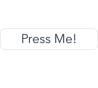

Every transition has a source and target state, and a transition criteria. When the transition criteria is met, the machine "takes" the transition and changes to the target state. You can see a transition's criteria in the examples by hovering over the disclosure diamonds in the state machine diagrams.
Taking a transition is the only way a state machine will change state. There is no way to "force" a machine into a state.
State machines grow gracefully through the addition of new states. For example, we will add a new behavior to the simple push button such that it enlarges slightly when it has been pressed for an extended period of time.

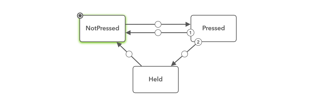
Property expressions
In the simple push button example, the background color of the button is light gray when it is pressed or held and white when it is not. Likewise the button is scaled slightly when it is in the help state.
With a state machine, we can declare a different property expressions for each state and Zing will ensure that it is updated whenever necessary. Declaring the property expression for a specific state is similar to a regular declaration, except you append the special @StateName modifier to the property name like this:
Rectangle {
    color: #white
    color@Pressed: #dedede
    color@Held: #dedede
    scale@Held: 1.15
}
When there isn't an explicit declaration for a state, as is the case with the color property and the NotPressed state, the regular property value - in this case white - is used.
Although the property expressions shown are only simple literal values, you can use any expression just like you can with a non-state property declaration.
Nested states
The state machines seen so far have been a type of linear state machines known as finite state machines. Finite state machines are extended by adding new top-level states to the machine for each possible configuration they can represent.
The downside of this approach can be seen in our three state button. We have had to duplicate both the release transition and the color property declaration in both the Pressed and Held states. As Held is an entirely new state we will have to manually duplicate any additional behavior we want it to share with the Pressed state both now and in the future.
Conceptually, the Held state is not really a separate state. Instead it is a refinement of the Pressed state. Whenever the button is being held, it is also simultaneously being pressed. We can model "refinement" relationships like this by nested state machines.
Nesting state machines allow you to embed a complete state machine inside an existing state. The nested state machine is evaluated whenever the parent state is active.
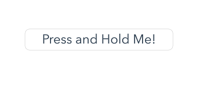
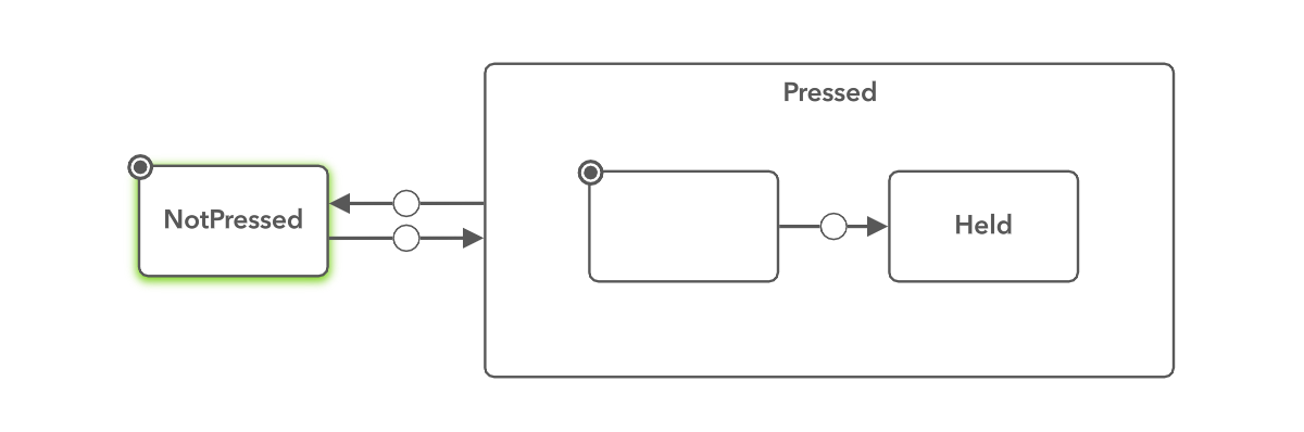
Rectangle {
    color: #white
    color@Pressed: #dedede
    scale@Held: 1.15
}
Parallel states

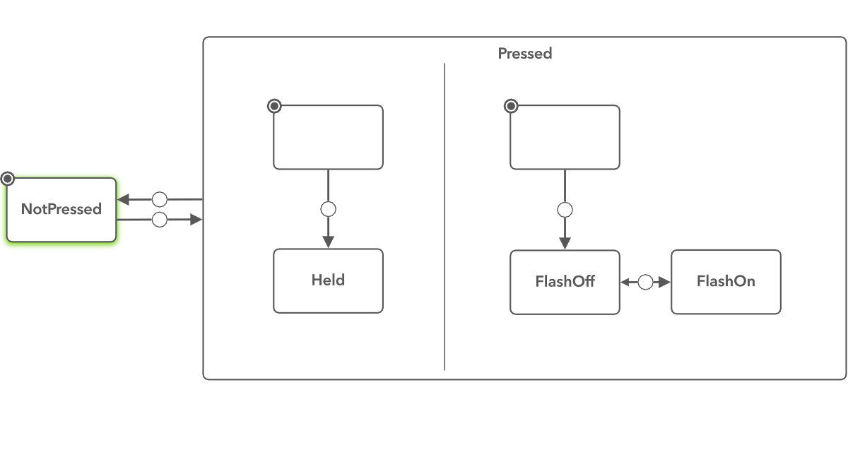
Rectangle {
    color: #white
    color@Pressed: #dedede
    scale@Held: 1.15
    Text {
        visible@FlashOff: false
        text: "Press and Hold Me!"
    }
}
Pseudo States
It is often useful to modify property expressions based on the category of device your app is running on. To this end Zing includes a special device() directive that can be used in place of a regular state name to determine current device type. The device directive includes a comma separated list of device categories and is true whenever the current device meets one or more of those designations.
The following example sets the margin property differently depending on whether the device is an iPad, or an iPhone with a 4", 4.7" or 5" screen.
property Float margin: 5

margin@device(iPad): 10
margin@device(iPhoneScreen4): 15
margin@device(iPhoneScreen47,iPhoneScreen55): 20
The complete list of valid device designations is below.
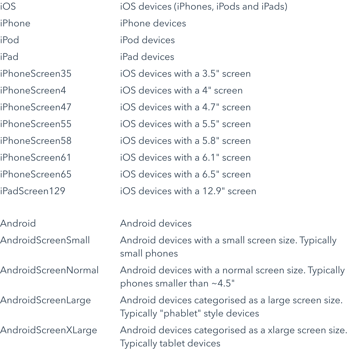
Share and export
You can share your Zing projects with others in two different ways.
Zing Share allows you to share your project online, where it can be opened in either Zing Studio on the Mac or PC, or directly from the Zing Preview app on iOS or Android.
Native export allows you to compile your Zing project as a native iOS and Android app and distribute it in the Apple App Store and Google Play Store.
Zing Share
Zing Share publishes your project online. Shared projects can be opened by anyone in Zing Studio on the Mac or PC, or in the Zing Preview app on iOS or Android. You don't need a Zing subscription to view a share!
To share a project, open the Share pane from the project explorer. This will give you the option to create a new share, or update the share if it already exists.
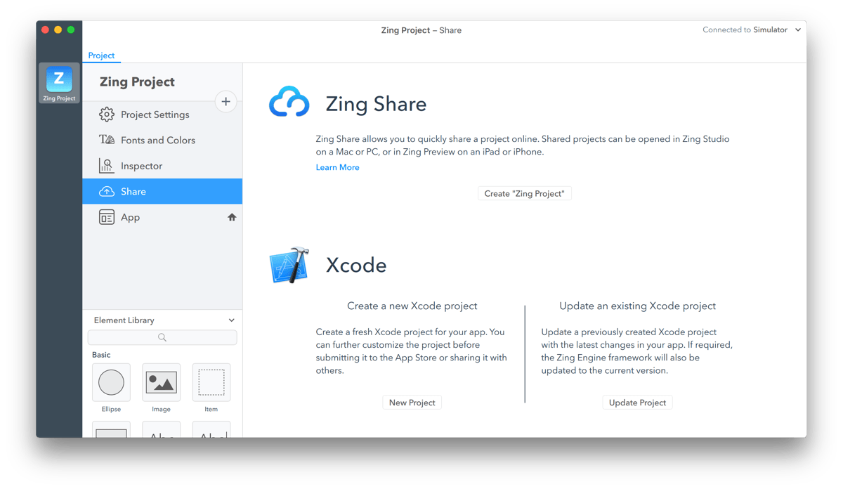
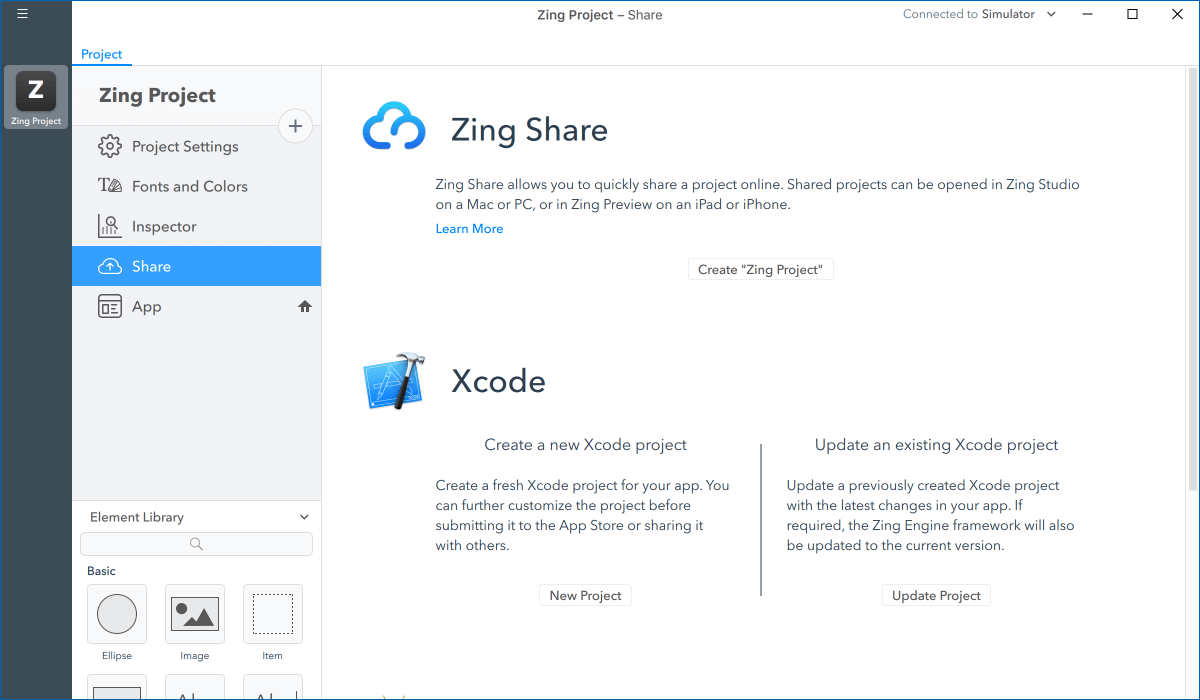
Once sharing completes, you are redirected to your share's landing page in your web browser. The URL of this page is your share link, and can be given to anyone you want to access your project.
Share links
Share links don't change when you update an existing share. Anyone opening your project will automatically get the latest version.
If you delete and re-share a project, a new share link is created.
You can view and delete your current shares by logging into your account at www.zingstudio.io.
Native export
Developer subscription
The native export feature requires a Zing Studio developer subscription.
Zing projects can be exported as native Xcode and Android Studio projects. Xcode is the development environment for iOS devices, and Android Studio the development environment for Android devices.
Exporting your Zing project allows you to compile it as a native app, and distribute it through the Apple App Store and Google Play Store.
To share a project, open the Share pane from the project explorer. This will give you the option to create a new native project, or update an existing project, for Xcode or Android Studio.
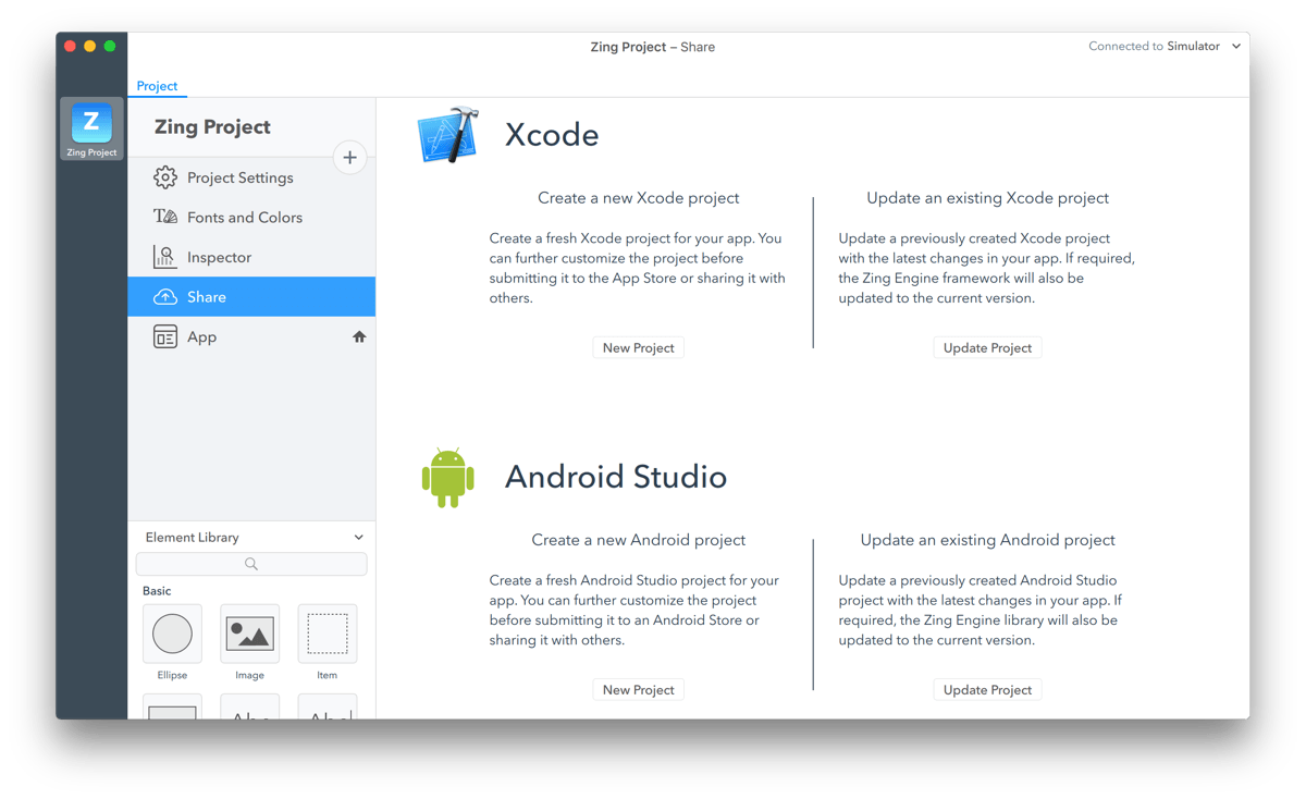
Exporting a new project creates a fresh application project, ready to be opened and run in Xcode or Android Studio. Updating an existing project updates just the Zing components of the Xcode or Android Studio project, and leaves any native code or configuration changes you have made intact.
Xcode projects
Zing Studio for Windows can create and update Xcode projects. However, as Apple's Xcode is not available for Windows, you will require a Mac to actually build and run your iOS projects.Working with native apps is not always as easy as Zing. You may require additional assistance from an experienced iOS or Android developer in order to submit your application to the Apple App Store or the Google Play Store.
Native apps
Working with native apps is not always as easy as Zing. You may require additional assistance from an experienced iOS or Android developer in order to submit your application to the Apple App Store or the Google Play Store.Learn more about working with exported Zing apps in the Native Developer API reference documentation.