Anchors
Anchors allow you to position items relative to one another. Anchors work by defining relationships between the edges of one item and the edges of another.
For example, the following anchors to top edge of rect2 to the bottom edge of rect1. Regardless of where rect1 is positioned, rect2 will be 20 points below it.
Rectangle as rect1 {
    color: #red
}

Rectangle as rect2 {
    anchor top = rect1.bottom + 20
    color: #orange
}

Anchors are convenient, but are just a shorthand for the equivalent property expressions, like that shown below.
Rectangle as rect2 {
    y: rect1.y + rect1.height + 20
    color: #orange
}
This is the general form of an anchor:
anchor Target Attribute = Source Attribute + Constant
Parent anchors
As it is so common, a shorthand exists for anchoring directly to an item's container.
If you are anchoring directly to the same attribute in the parent, you can omit the right hand side of the anchor entirely. For example, the following pairs of anchors are equivalent.
// Anchor to the right side of my container
anchor right
anchor right = parent.right

// Fill my container
anchor bounds
anchor bounds = parent.bounds
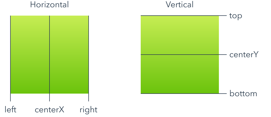
Edge attributes
The six primary edges, three horizontal edges and three vertical edges, are shown below. Anchored edges must be on the same axis, so you can't anchor a horizontal edge to a vertical edge or vice versa.
You can anchor an item to any of its siblings, or to its container item. For example, you can achieve the example shown in the previous section using anchors like this:
Rectangle {
    width: 100
    height: 100
    color: #orange

    Rectangle {
        anchor centerX = parent.centerX
        anchor bottom = parent.bottom
        width: 50
        height: 50
        color: #lightblue
    }
}
Anchors and property expressions can be mixed where they don't conflict. In the example above, we used the width and height properties to specify the size and used anchors to set the position.
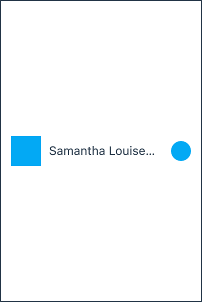
Anchors can be chained together to create more complex layouts.
Rectangle as icon {
    anchor left = 10
    color: #lightblue
}

Text as name {
    anchor left = icon.right + 8
    anchor right = more.left - 8
    text: "Samantha Louise Applebee"
}

Ellipse as more {
    anchor right = parent.right - 10
    color: #lightblue
}
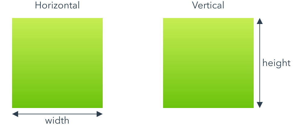
Size attributes
The two size attributes, width and height, are shown below.
Like with edge attributes, you can anchor an item's size to any of its siblings, or to its container item.
You can also include a scale factor when anchoring a size attribute. For example, the following anchor sets an item's width to half its container width plus 20.
anchor width = 0.5 * parent.width + 20
Compound attributes
In addition to the primary anchor attributes, there are five compound attributes that allow you to anchor to the bounds, size or center of an item more concisely. Compound attributes are just a convenience and are equivalent to anchoring multiple primary attributes at once.
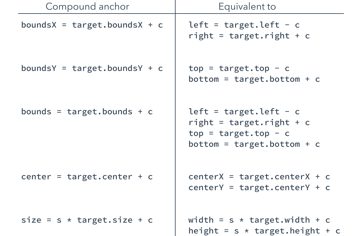
Bounds anchor constants
A positive constant in a bounds anchor expands the bound about each edge, and a negative constant shrinks it. Think "plus makes it bigger" and "negative makes it smaller".
Rectangle {
    color: #orange

    Rectangle {
        anchor bounds = parent.bounds - 20
        color: #lightblue
    }
}

Design view
The design view understands the anchors you declare in your code, and anchored items are positioned correctly. However, when adding and manipulating new items, a simplified version of the anchor model is presented in the user interface.
The simplified geometry pane allows you to quickly construct and modify a layout by focusing on the essentials. If you require additional refinements, you can switch to the code view to add them.
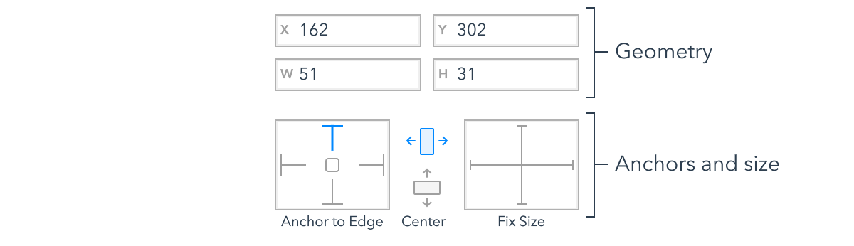
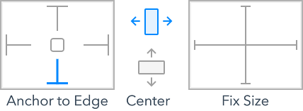
The geometry pane is found at the top of the property panel when an item is selected in the design view. An example is reproduced above.
Geometry
The x, y, width and height fields show the values for the item's geometry.
If you modify these values, Zing will try and make the change by adjusting the current anchors. For example, if you modify the x field for the following item, Zing would adjust the right anchor's constant instead of assigning the x property directly.
Ellipse {
    anchor right = parent.right - 20
}
Anchors and size
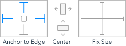
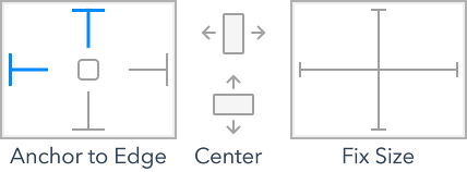
The anchors and size section shows the anchor and sizing contraints applied to the item. The struts and icons are toggles, with blue indicating enabled and gray disabled.
Each strut in the "anchor to edges" diagram represents an anchor from the item to its container. If the strut is enabled, the item is anchored on that edge.
The "center" icons represent horizontal and vertical centering anchors. When the icon is enabled, the item is centered, relative to its container, on that axis.
The "fix size" struts indicate whether or not an item has been assigned an explicit width or height. If the strut is enabled, the item has an explicit size. If it is disabled, the item is either using its implicit size or its size is a side effect of the anchors applied.
Lets look at some examples.
The simplest case is assigning basic values to the x and y property.
Material.Spinner {
    x: 90
    y: 100
}
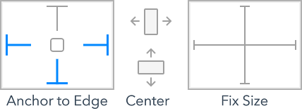
While not syntactically anchors, as items are positioned relative to their container, assigning an explicit position is effectively "anchoring" it to the top and left edges of its container.
Of course, you don't need to use the same "class" of anchor on both axis. The next example uses an edge anchor to set the item's y position, while using a center anchor to horizontally align itself.
Apple.Switch {
    anchor centerX
    anchor bottom = parent.bottom - 10
}
When multiple sides of an item are anchored, either directly or as part of a compound anchor, the anchor to edge struts are enabled accordingly.
Material.TextField {
    anchor boundsX = parent.boundsX - 20
    anchor bottom = parent.bottom - 80
}
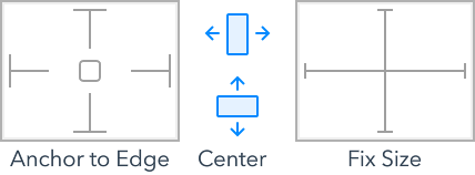
Equally, the compound centering anchor also enables both the horizontal and vertical center icons.
Apple.Spinner {
    anchor center = parent.center
}
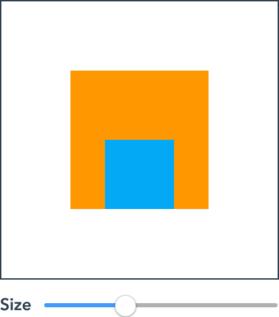
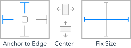
The final example assigns the item an explicit width value. Here we see the horizontal fix size strut enabled for the first time. In all the previous examples, the width either came from the element's implicit size or from the anchors applied to it.
Apple.TextField {
    x: 40
    width: 120
}
Setting constraints
As you position items in the design view, Zing will apply some simple anchoring rules automatically. However, you aren't stuck with the default choices Zing makes.
The struts and icons in the geometry view can be toggled by clicking on them. When you change constraints, Zing will update the anchors used and choose appropriate offset values to ensure that the item's current geometry doesn't change in the process.
The following video shows the process of positioning and anchoring a search field. It is easy to start out with a rough position and size, and then refine its geometry and anchors until they meet your needs.
The code created for this layout is shown below. In this example, the left and right anchors have been replaced with a single boundsX anchor. Where possible Zing will collapsed multiple individual anchors into compound anchors to increase the code's readability.
Material.SearchBox {
    anchor boundsX = parent.boundsX - 20
    y: 20
}